Case Study
Hopstair

This is a brief overview of this project (2 min read)
My role
User Interface Designer
User Experience Designer
Interaction Designer
What is HopStair?
Most people live lives that are rich with insecurities and poor coping mechanisms to account for things they are not at peace with. You might hide who you really are and pretend to be someone else, you might feel miserable inside – fearful, worried, anxious. You may just not like you or not believe in yourself.
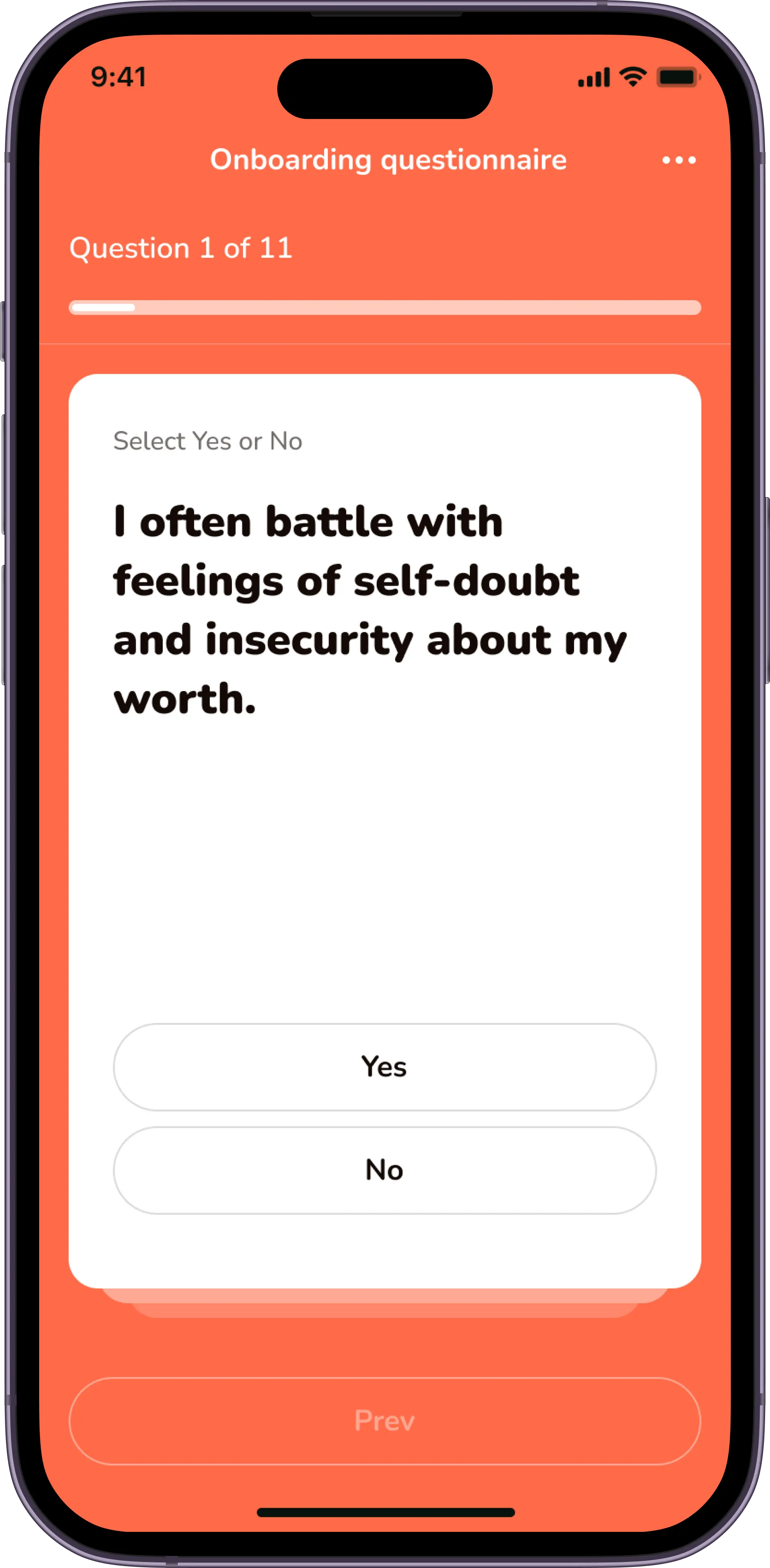
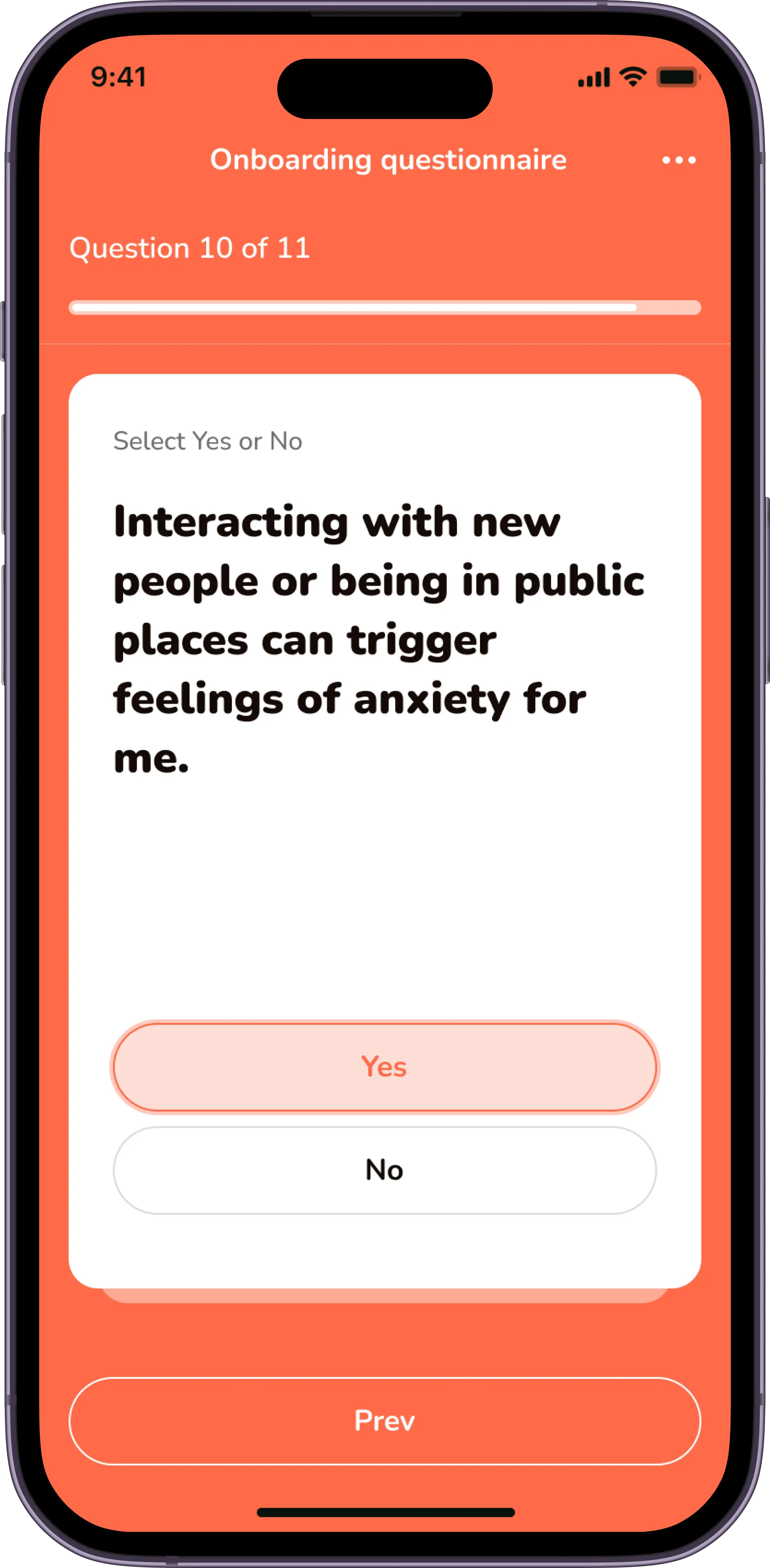
HopStair helps identify these problems with the aid of carefully curated questionnaires which builds scientifically tested routines that help people do better and be better for themselves and the society.
The questionnaire
Objectives
Upon joining the team as the lead designer, research, user journeys, and wireframes had been designed by an external UX company. The previous designer had also worked on flows/screens from onboarding to the dashboard. My role focused on bringing these elements to life by developing high-fidelity prototypes, testing, and iterating based on user feedback. The goal was a consistent cross-platform design for both iOS and Android.
The quest
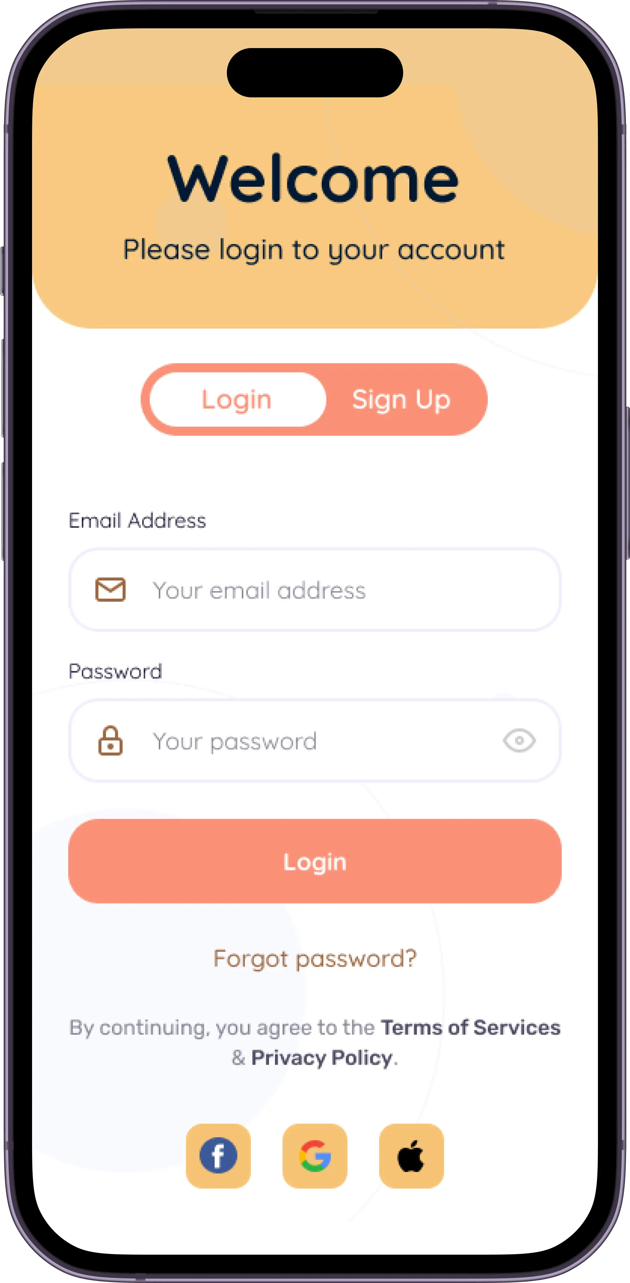
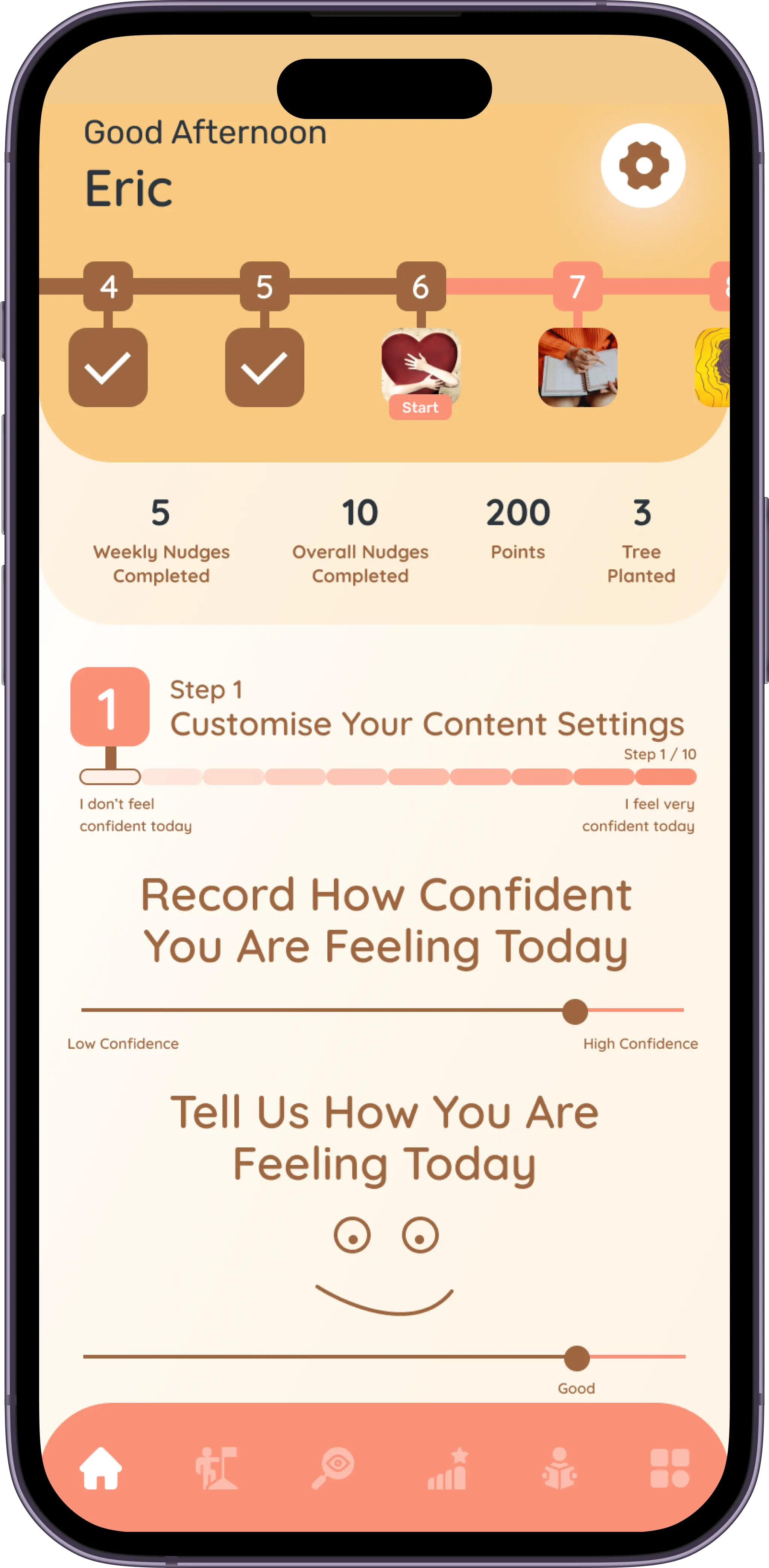
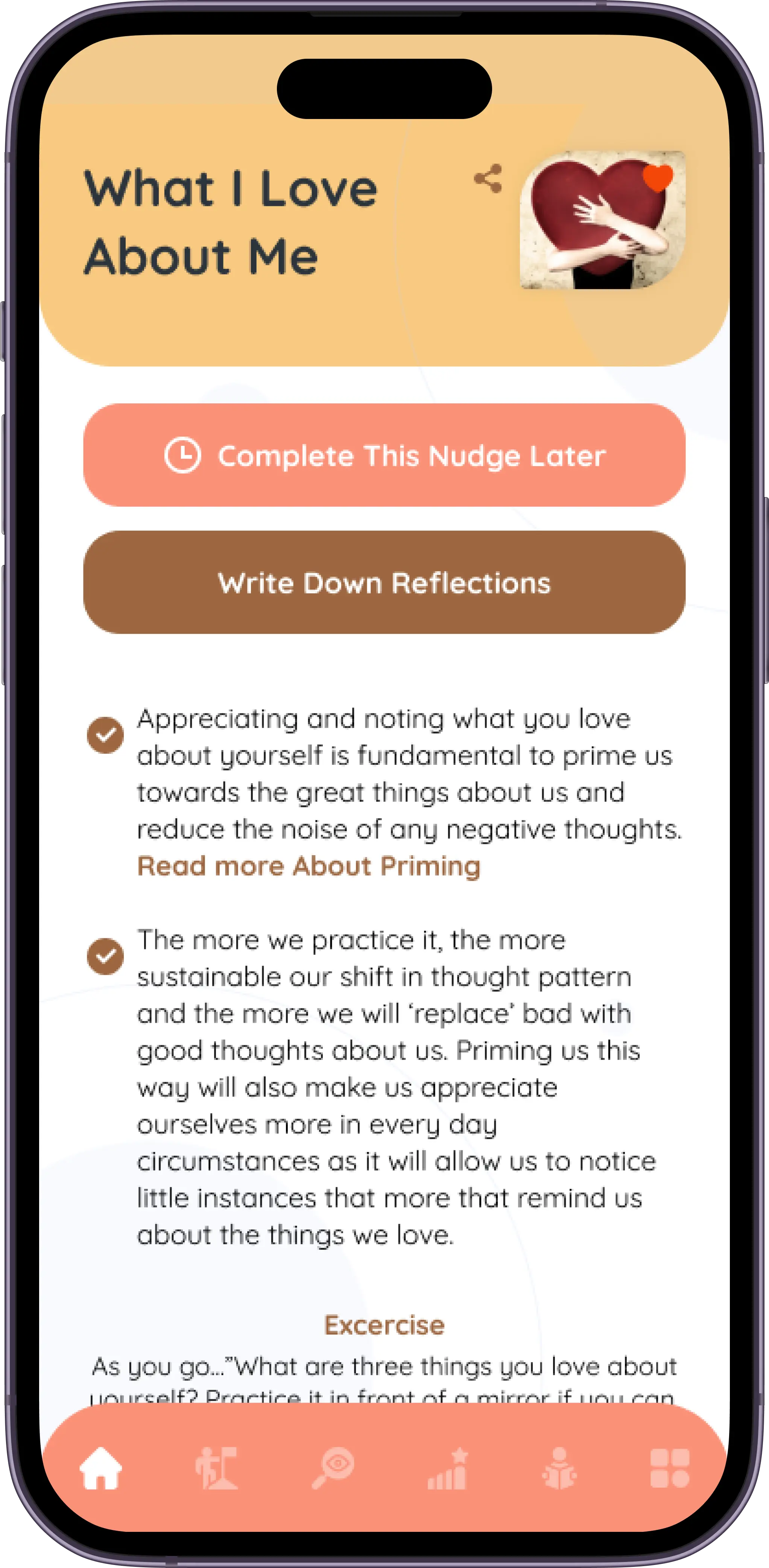
Even though research had been done and i had all i needed, i was still curious to understand some of the choices made. This led me to a deep dive into these decisions which would later lead my design choices. I gathered a small cohort of potential users and conducted interviews where i tested the already existing flows and designs. This investigation revealed some areas of improvement, and unfortunately the existing designs had to go, and the flows needed some minor tweaks.
The old design
Coming up with amazing ideas
This process involved brainstorming sessions with the other two(2) designers and the lead engineer on the team, to determine what was possible and what was not. I had to have an idea of the engineering teams tech stack and capabilities, this would help guide my decision making design-wise - that way we do not create designs that the engineering team cannot implement.
Key features
Content
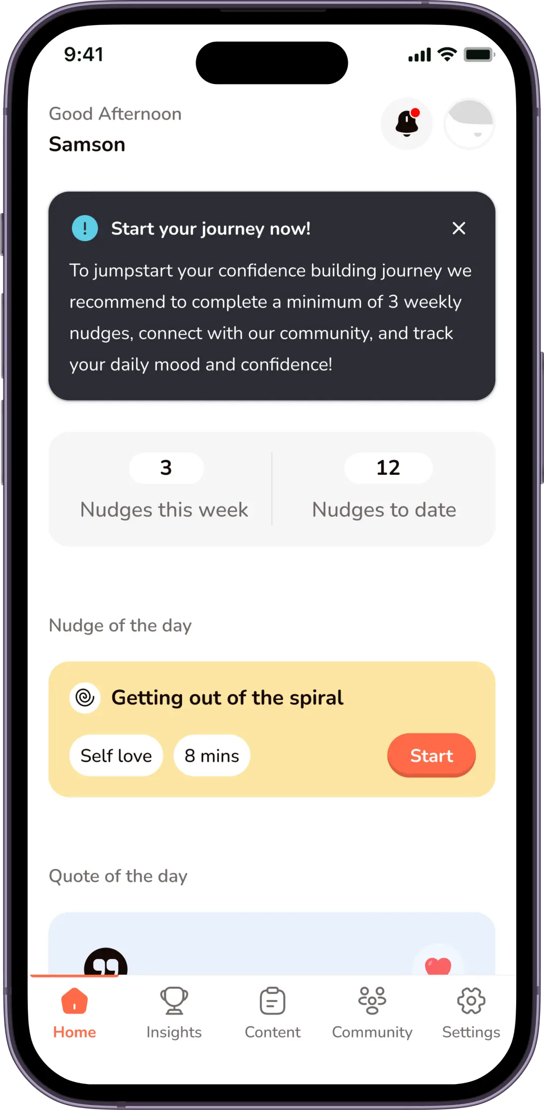
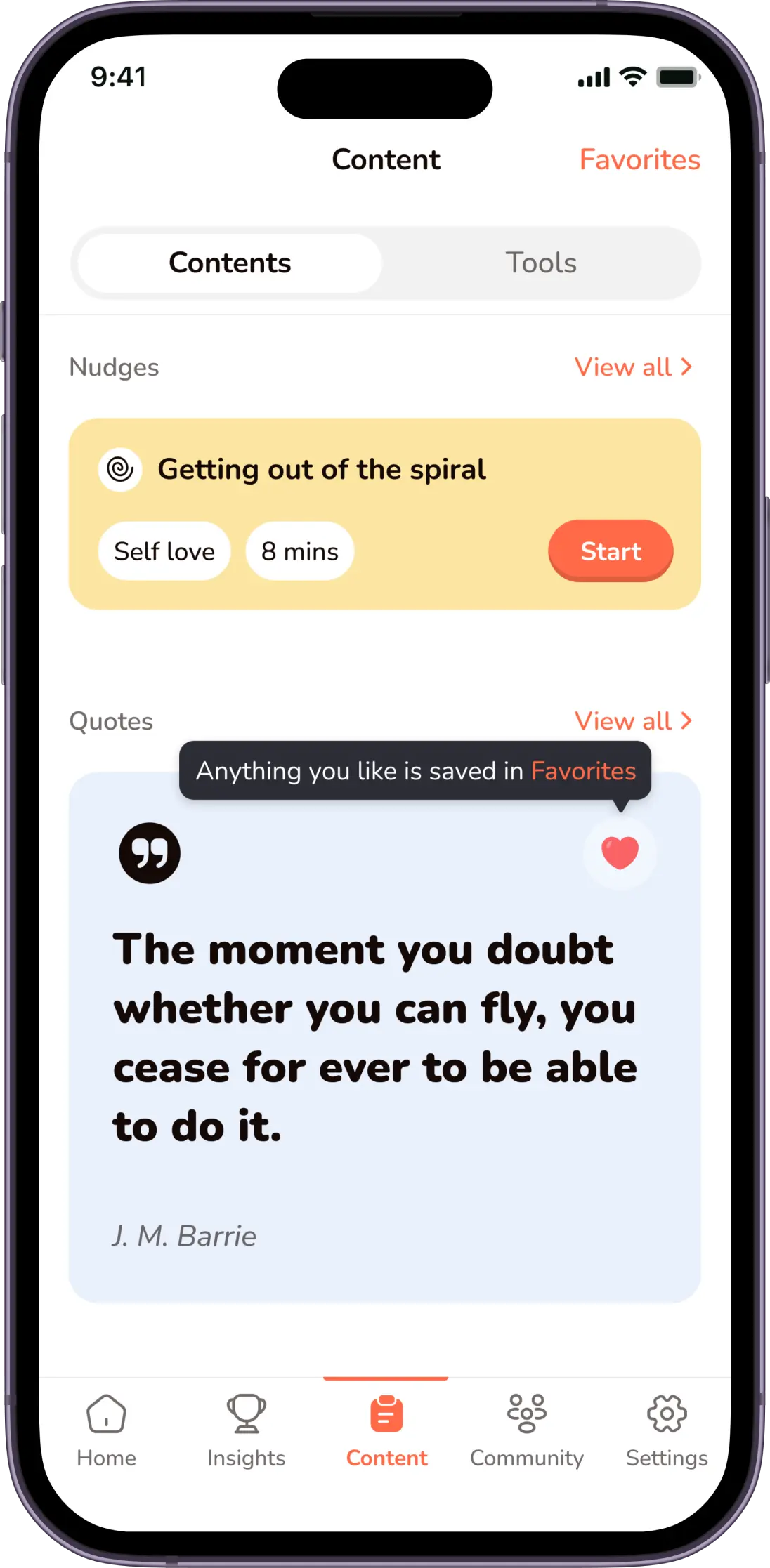
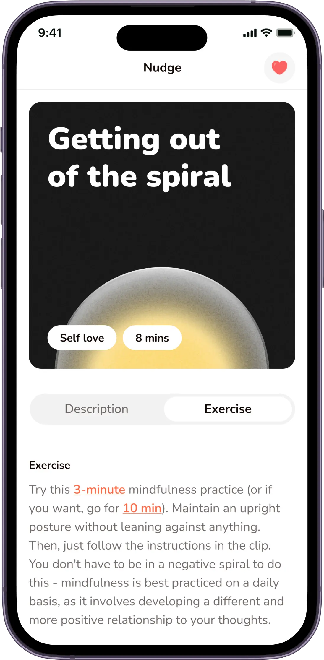
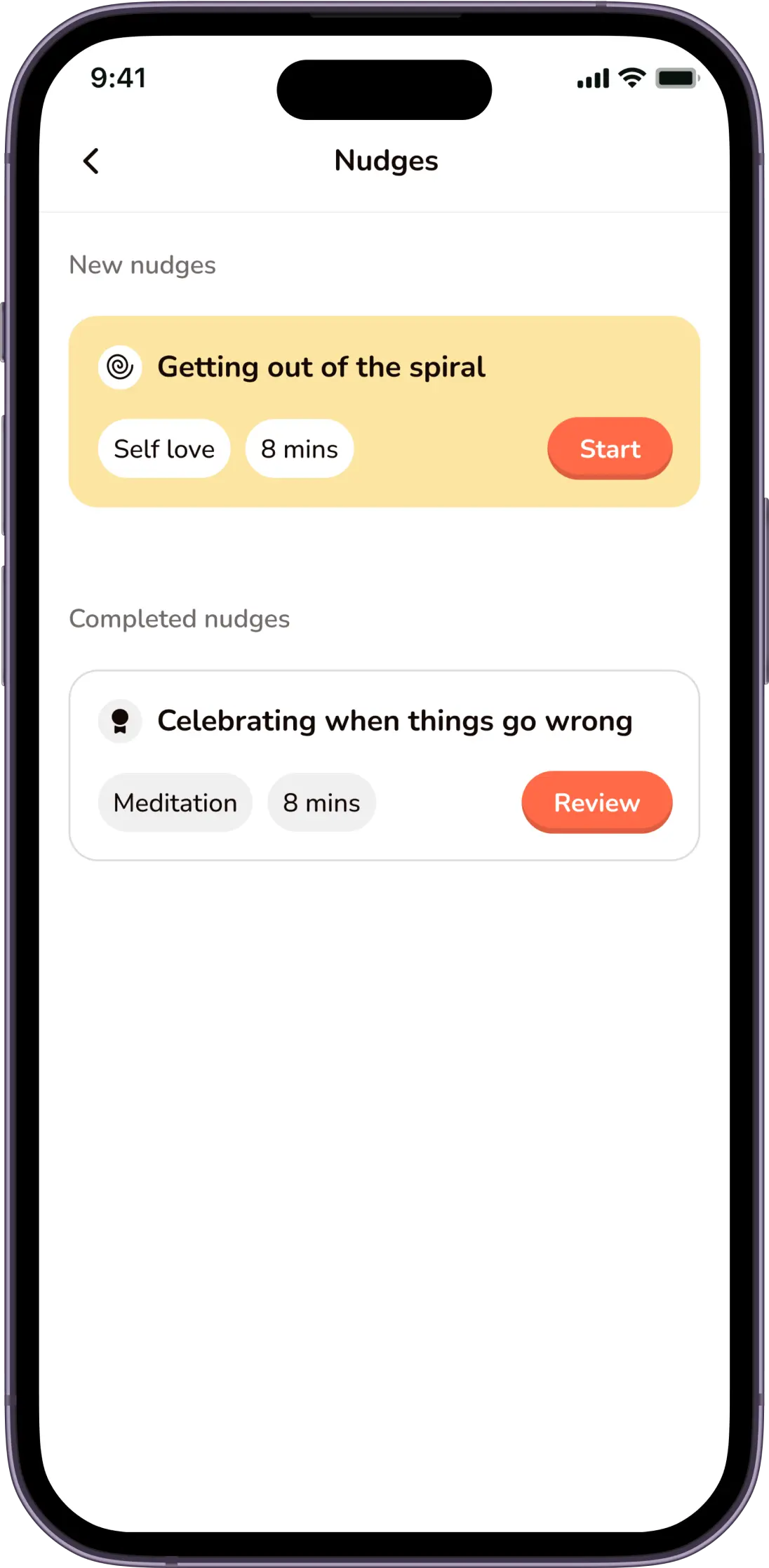
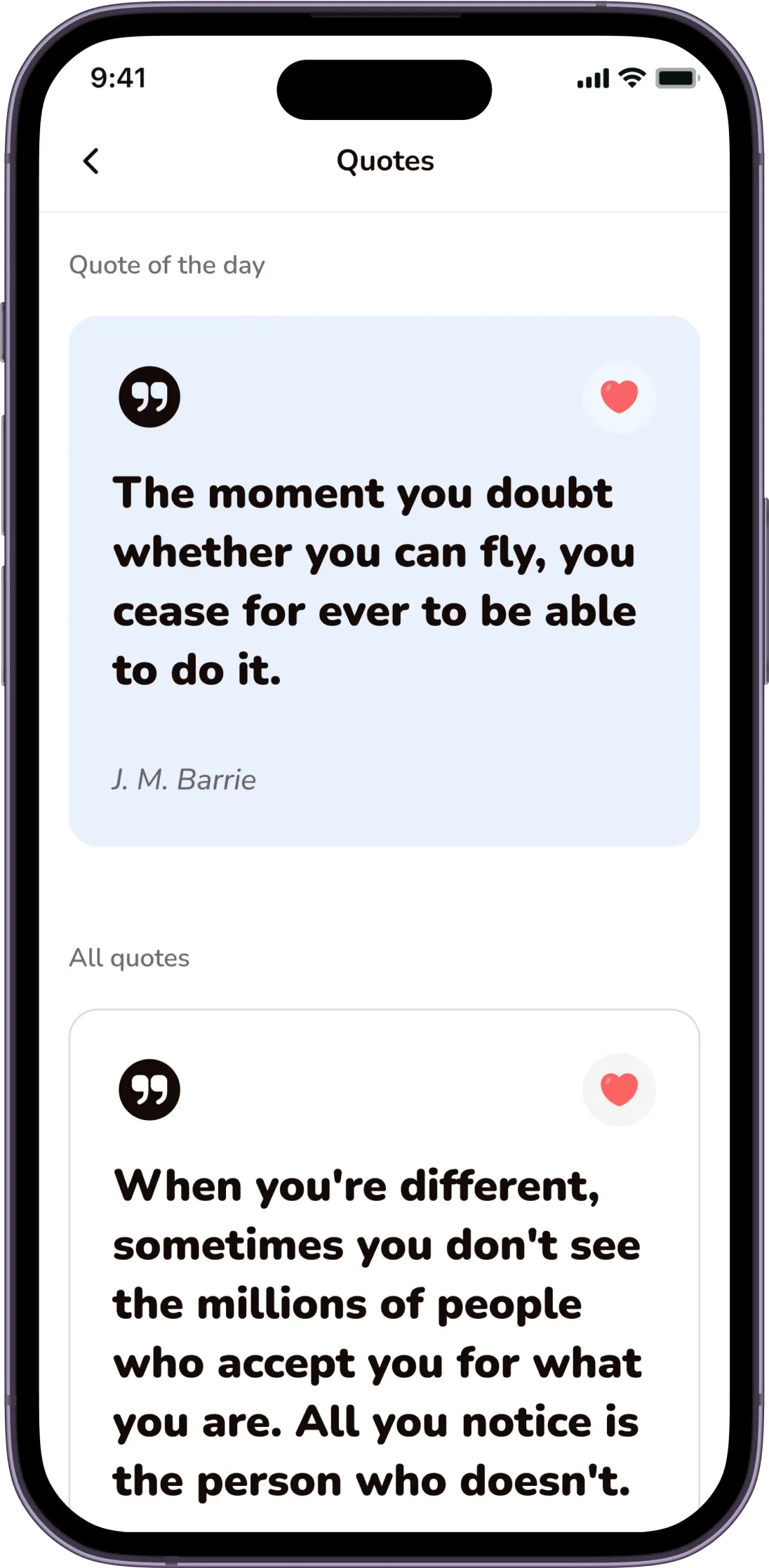
Content includes nudges, quotes and facts all based around different confidence categories, these content are sent to users timely depending on their subscription plan.
Daily Mood Rating
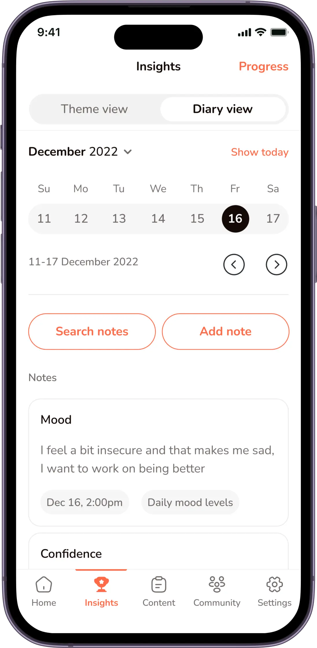
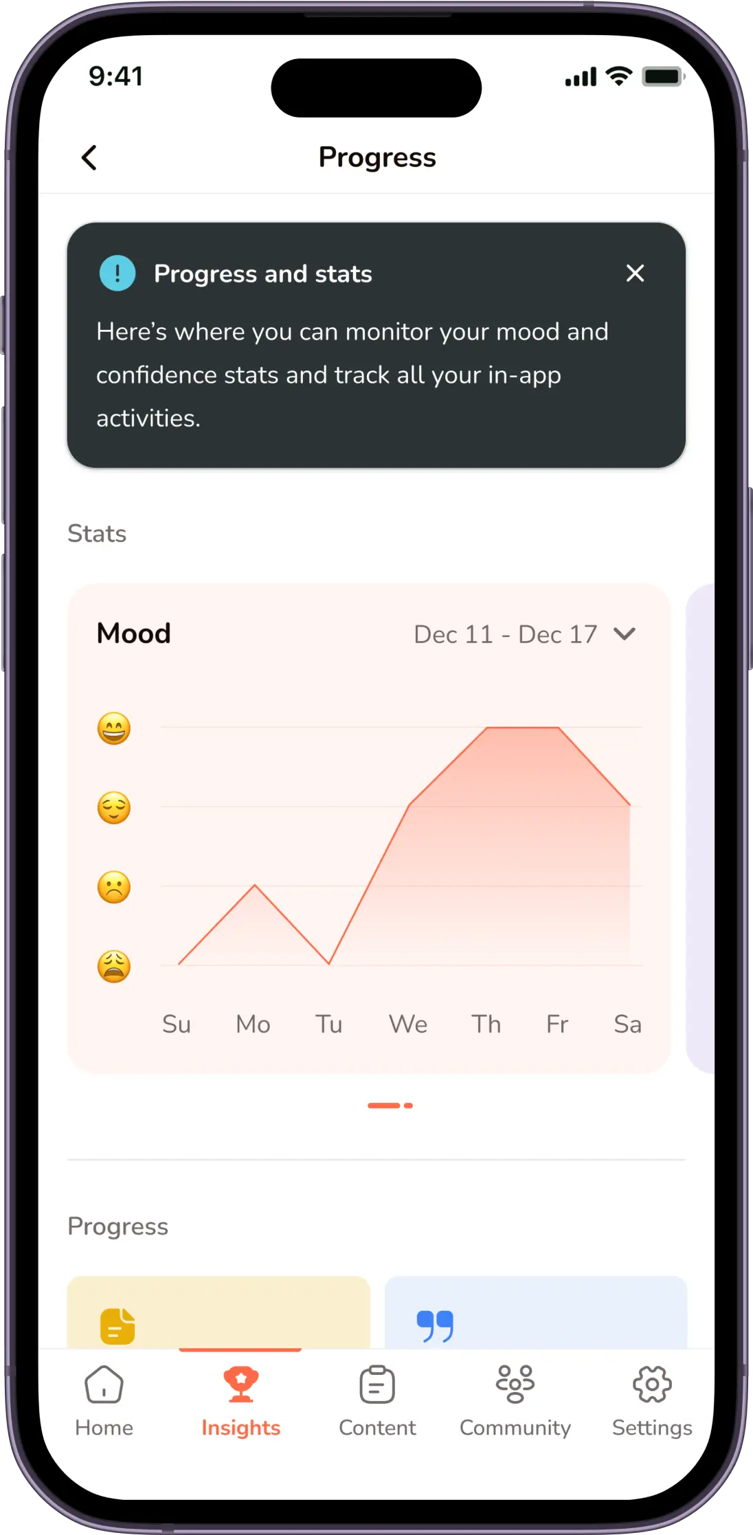
Each user rates their mood and confidence on a daily basis, this rating is tracked within the app and users can check this data to know how they are improving.
Community
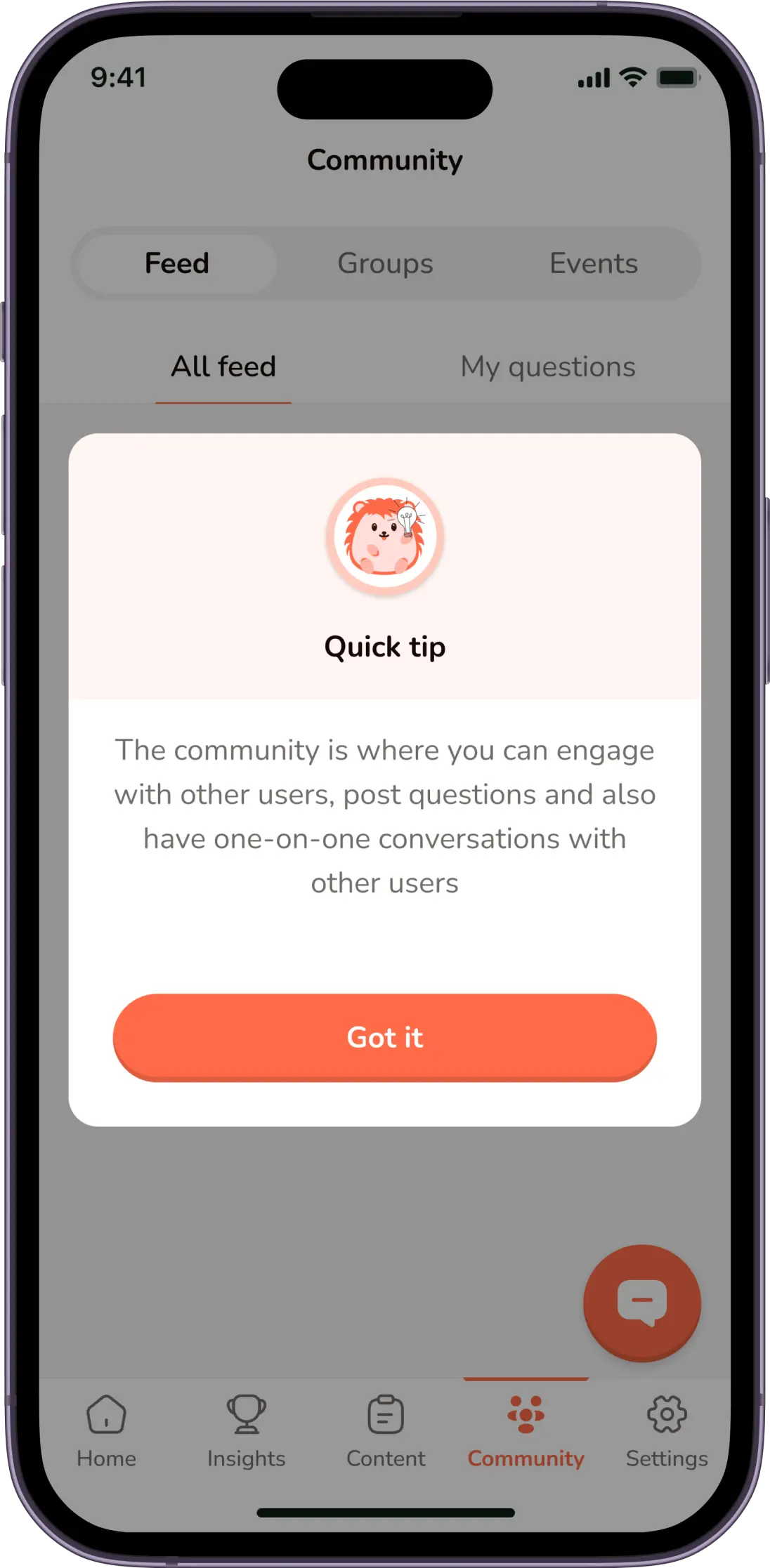
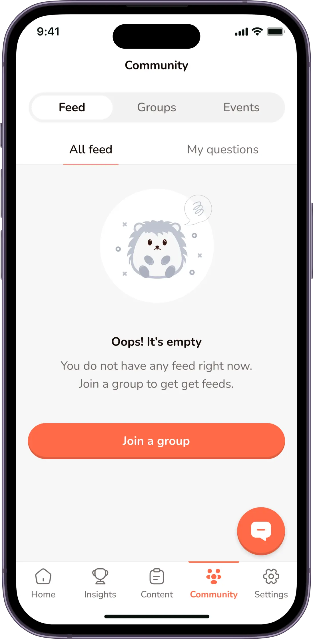
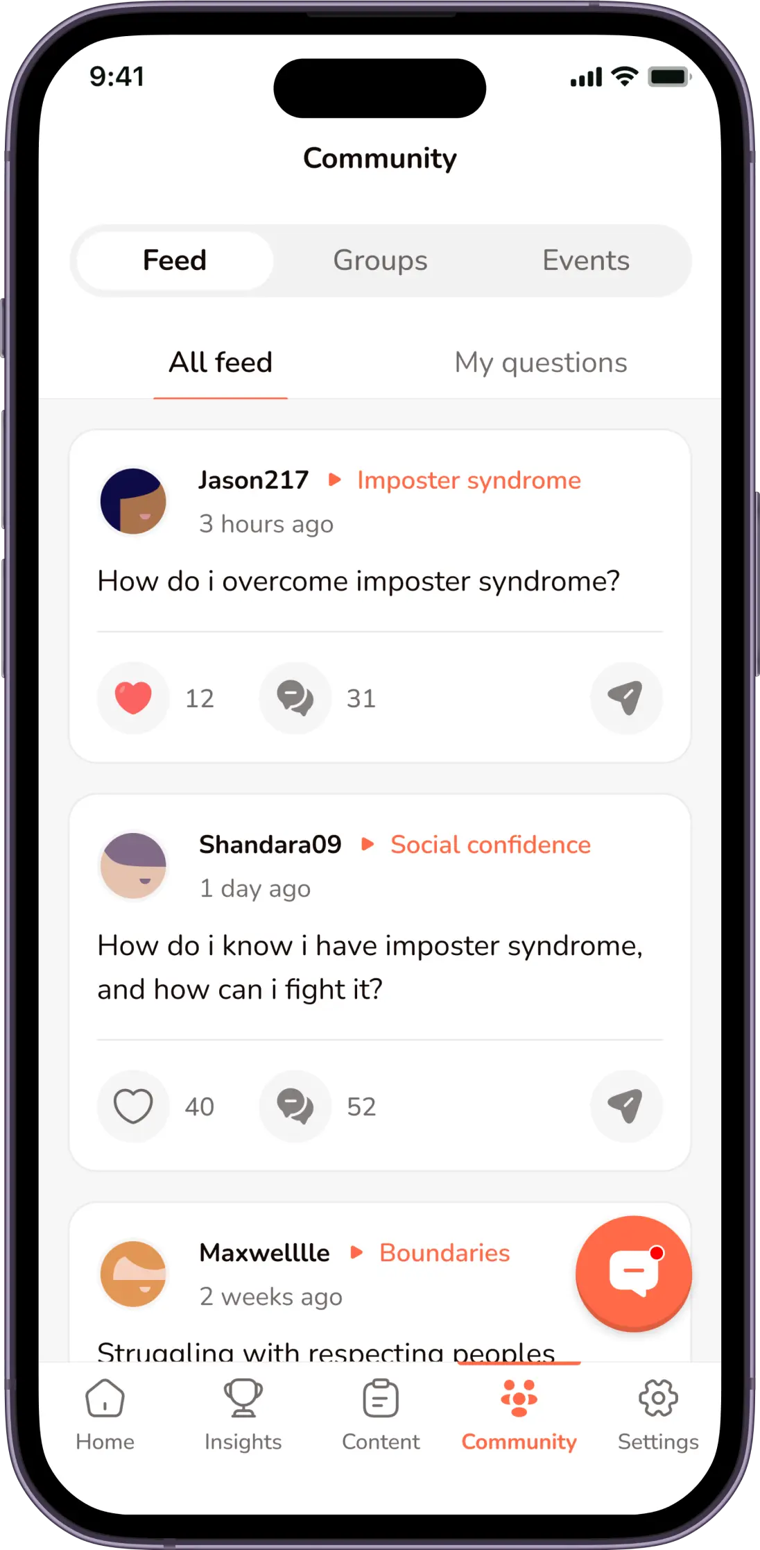
This is a section of the app where users post on different forums and have discussions anonymously in order to help one another feel better and be better.
In-app Confidence Coaches
If needed, users can signup for one-on-one confidence coaching mentorships all within the platform.
Now let me tell you about Hopsy
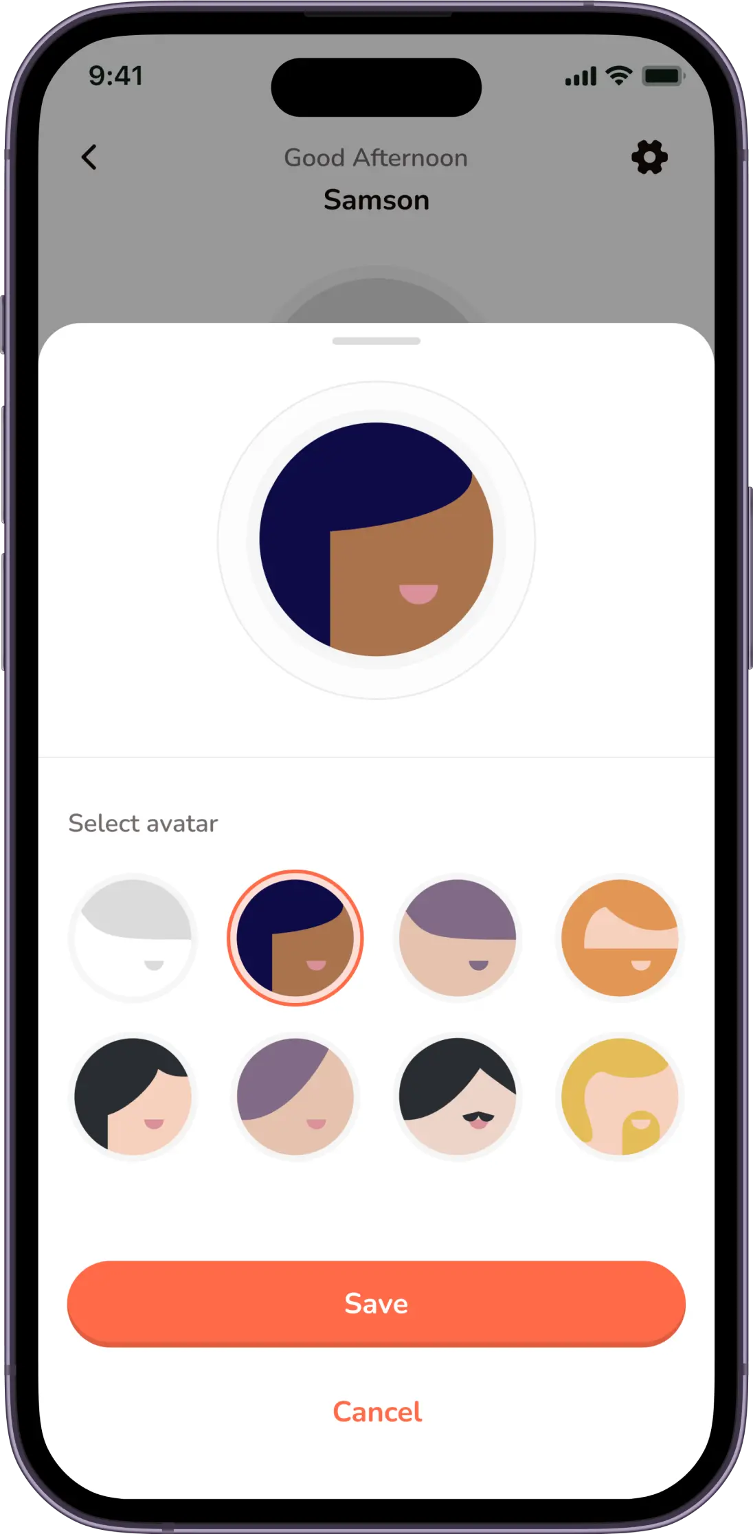
In a bid to foster engagement, the team came up with the idea of creating a custom Mascot called “Hopsy”, Hopsy would serve as an in-app buddy and help nudge/motivate users by creating a friendly bond with the users. We also came up with the idea of designing custom avatars, that users can use as their profile picture when interacting in the community, this would help keep each user anonymous and will make them feel more safe to share within the community.
The mascot & avatars
Hopsy

Avatars
Let's design!
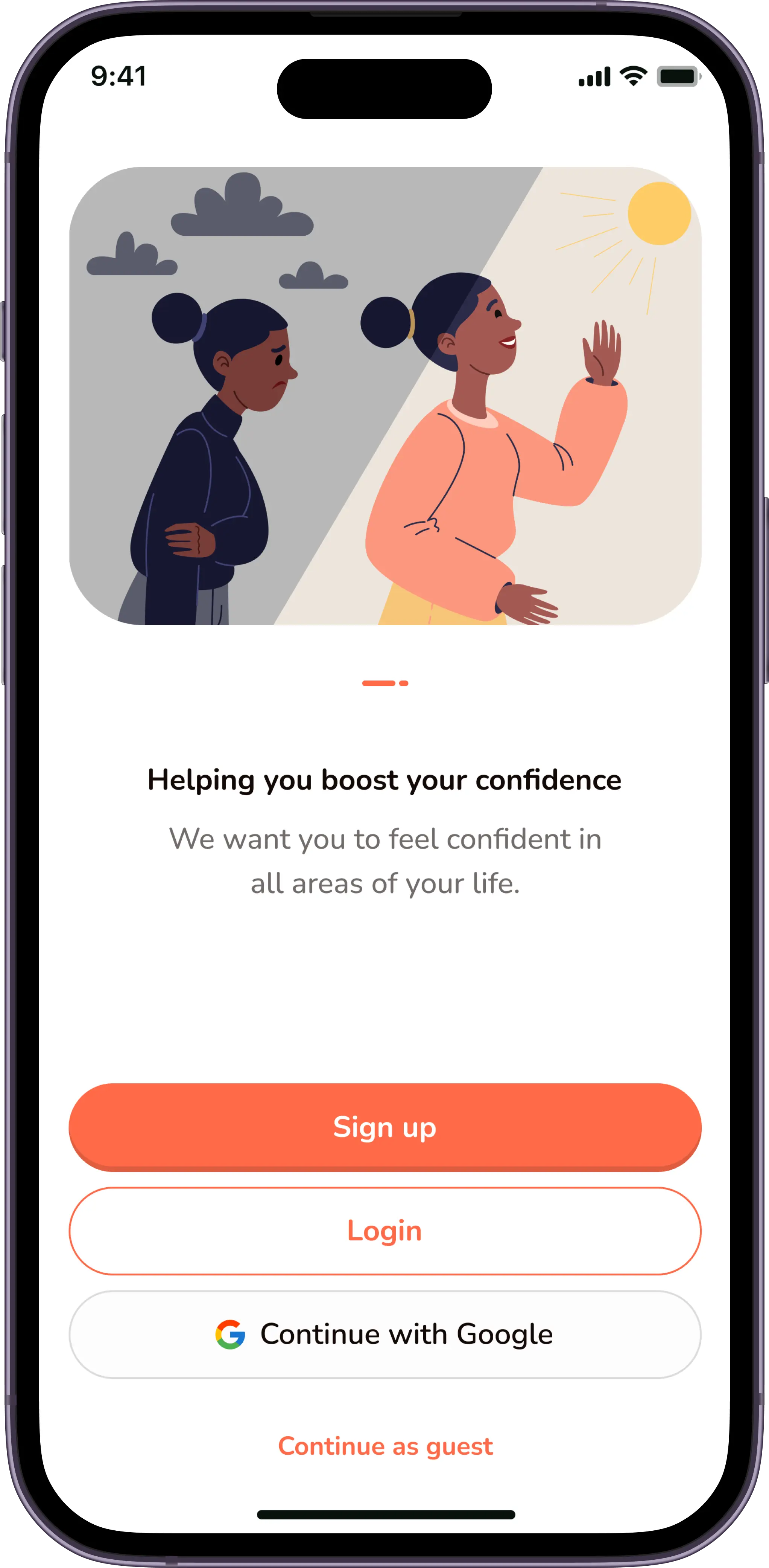
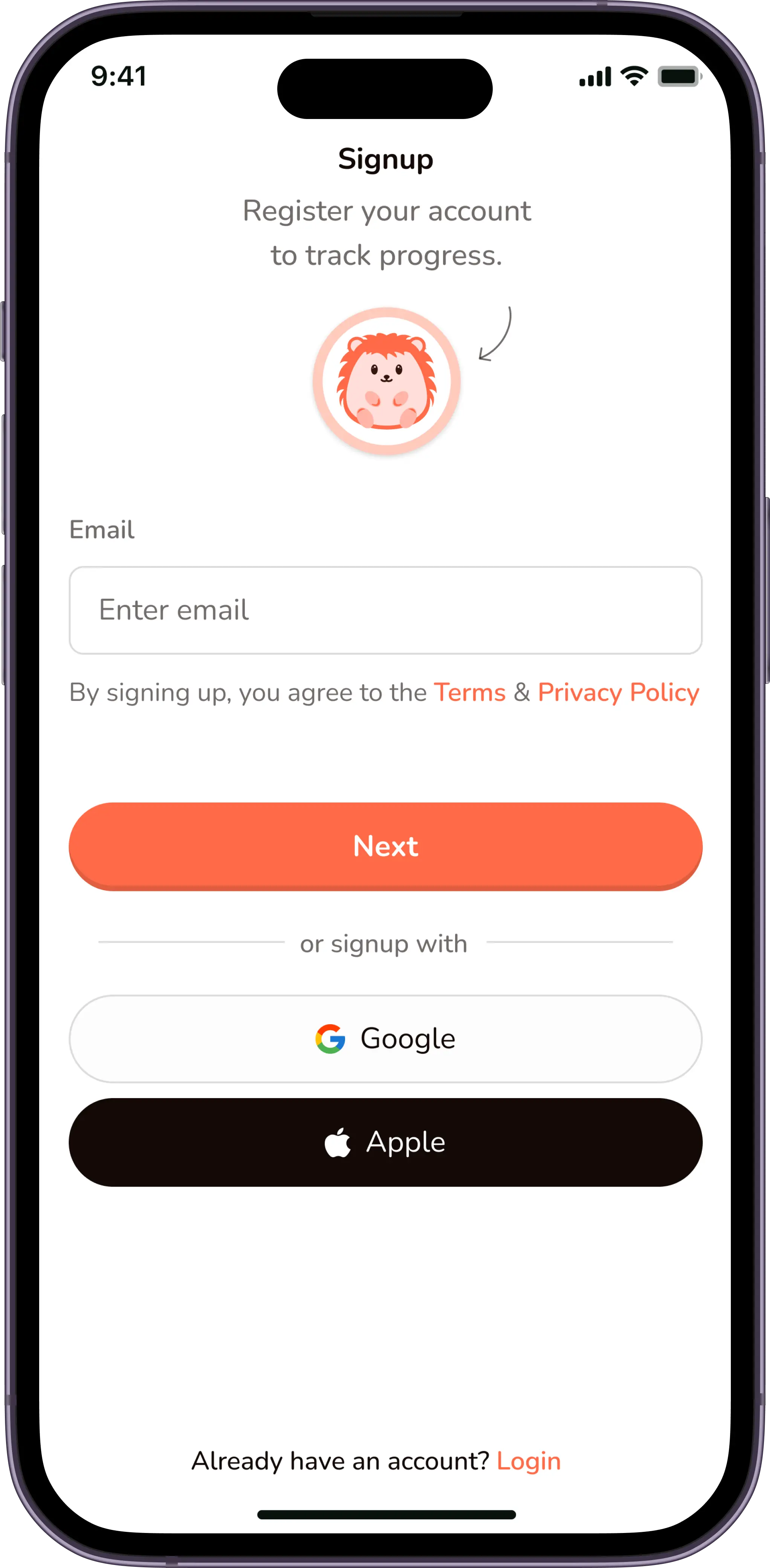
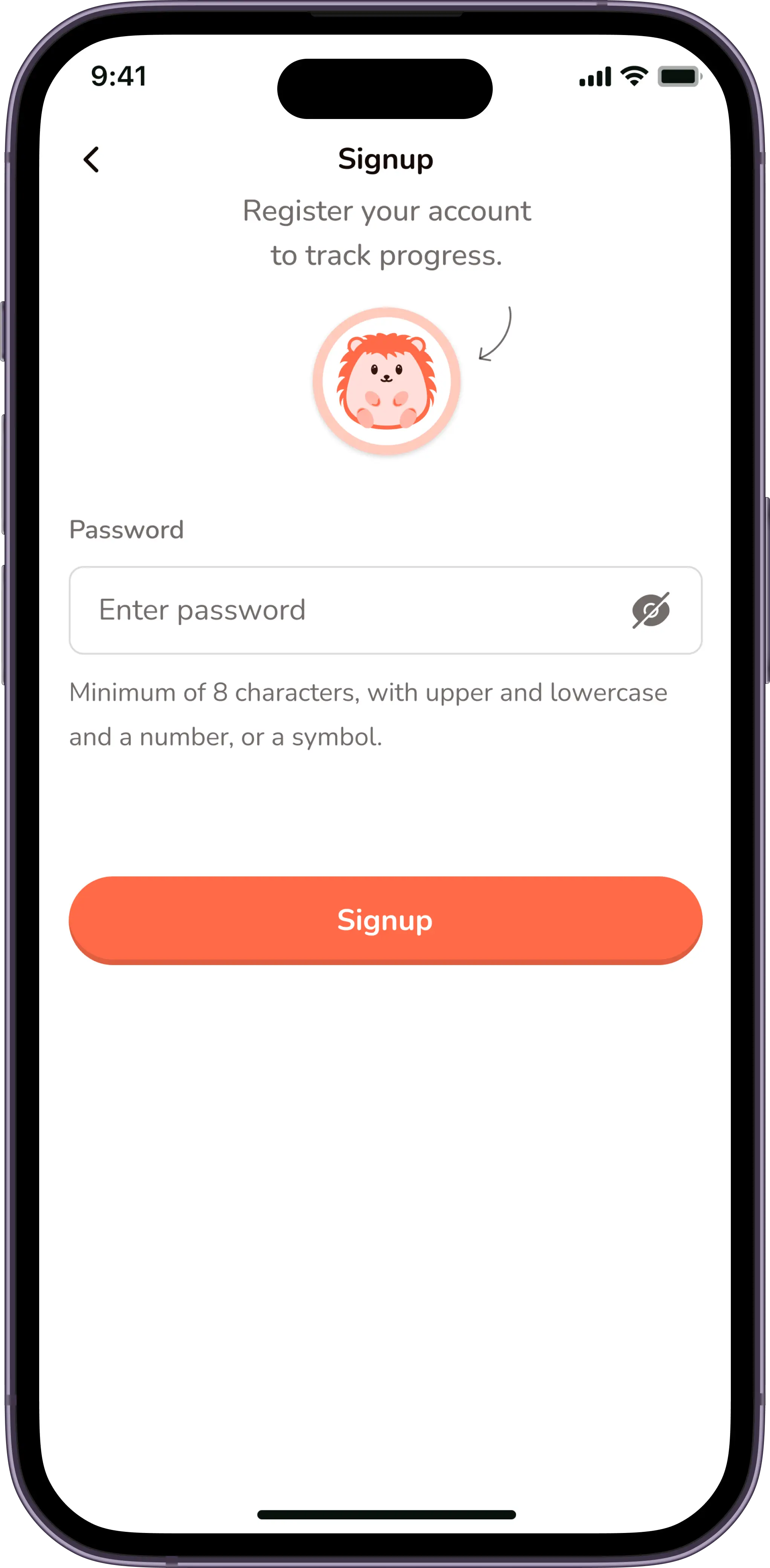
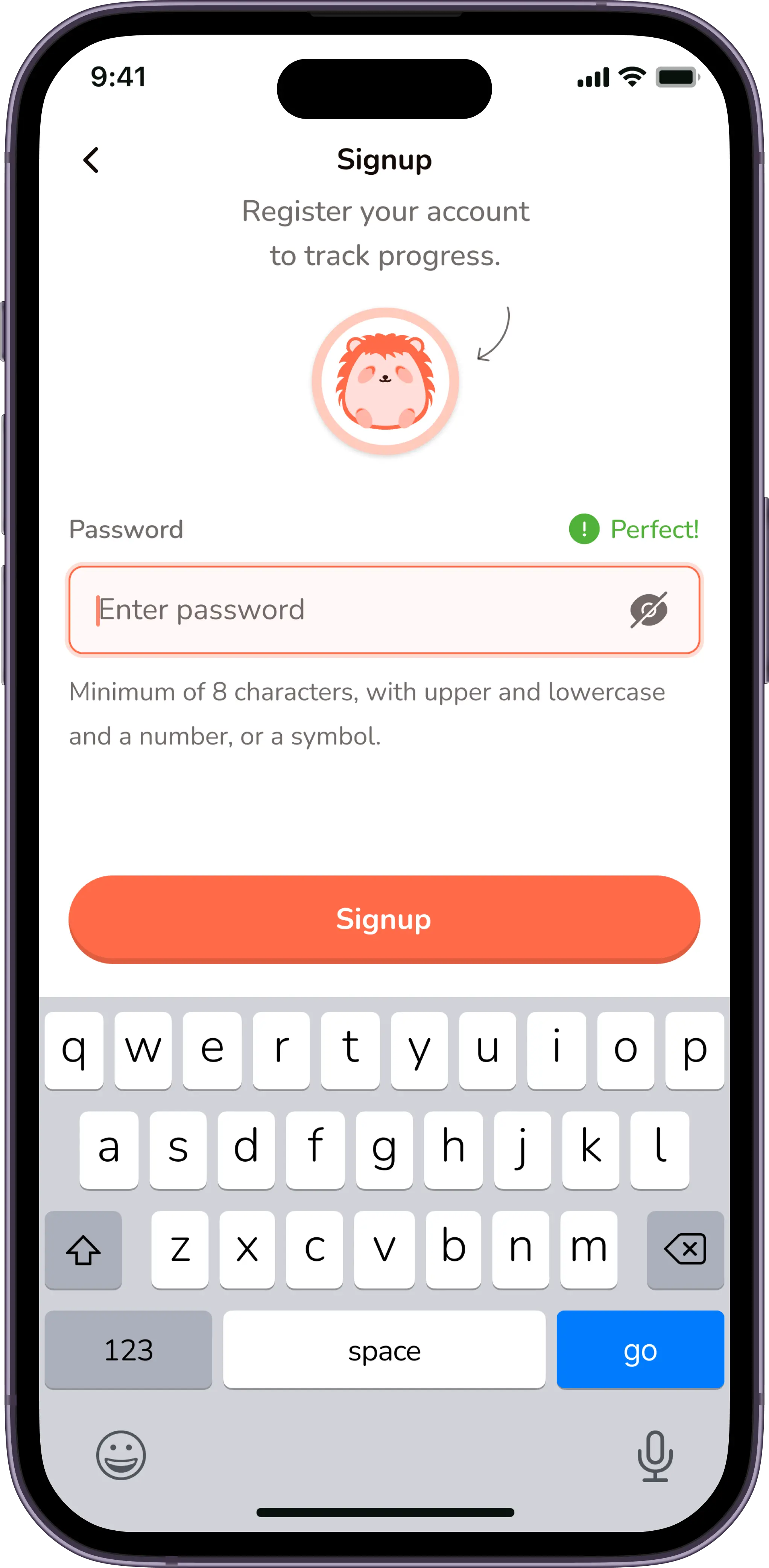
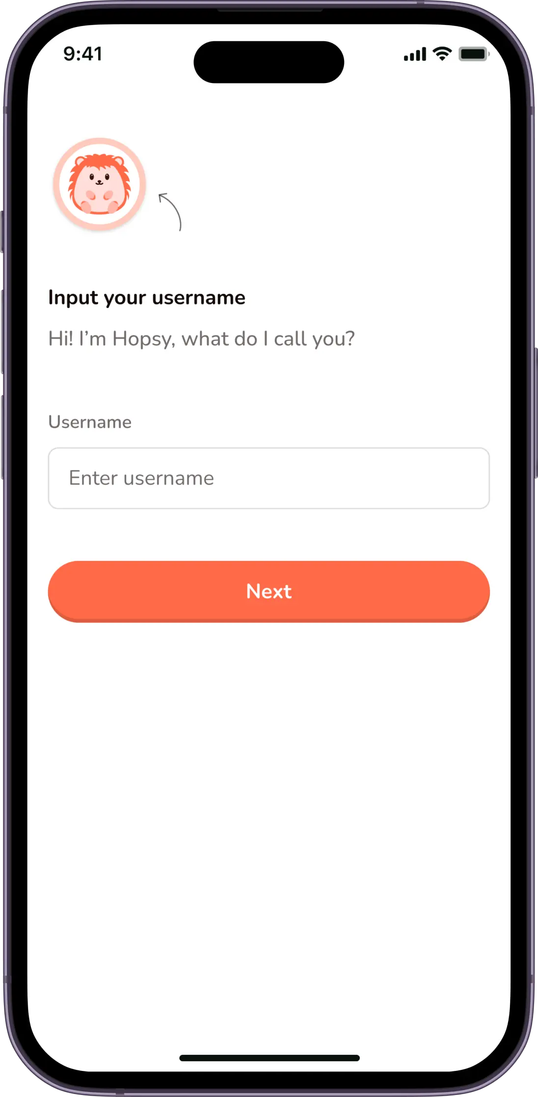
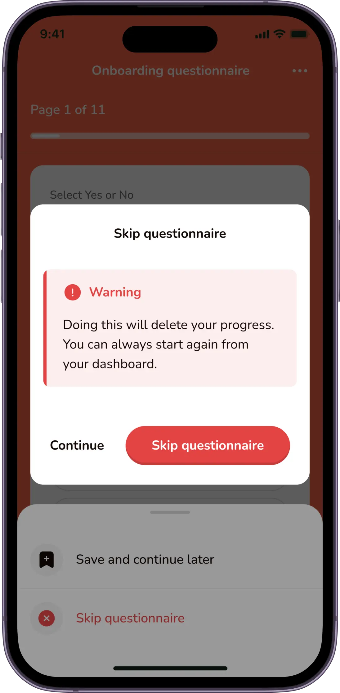
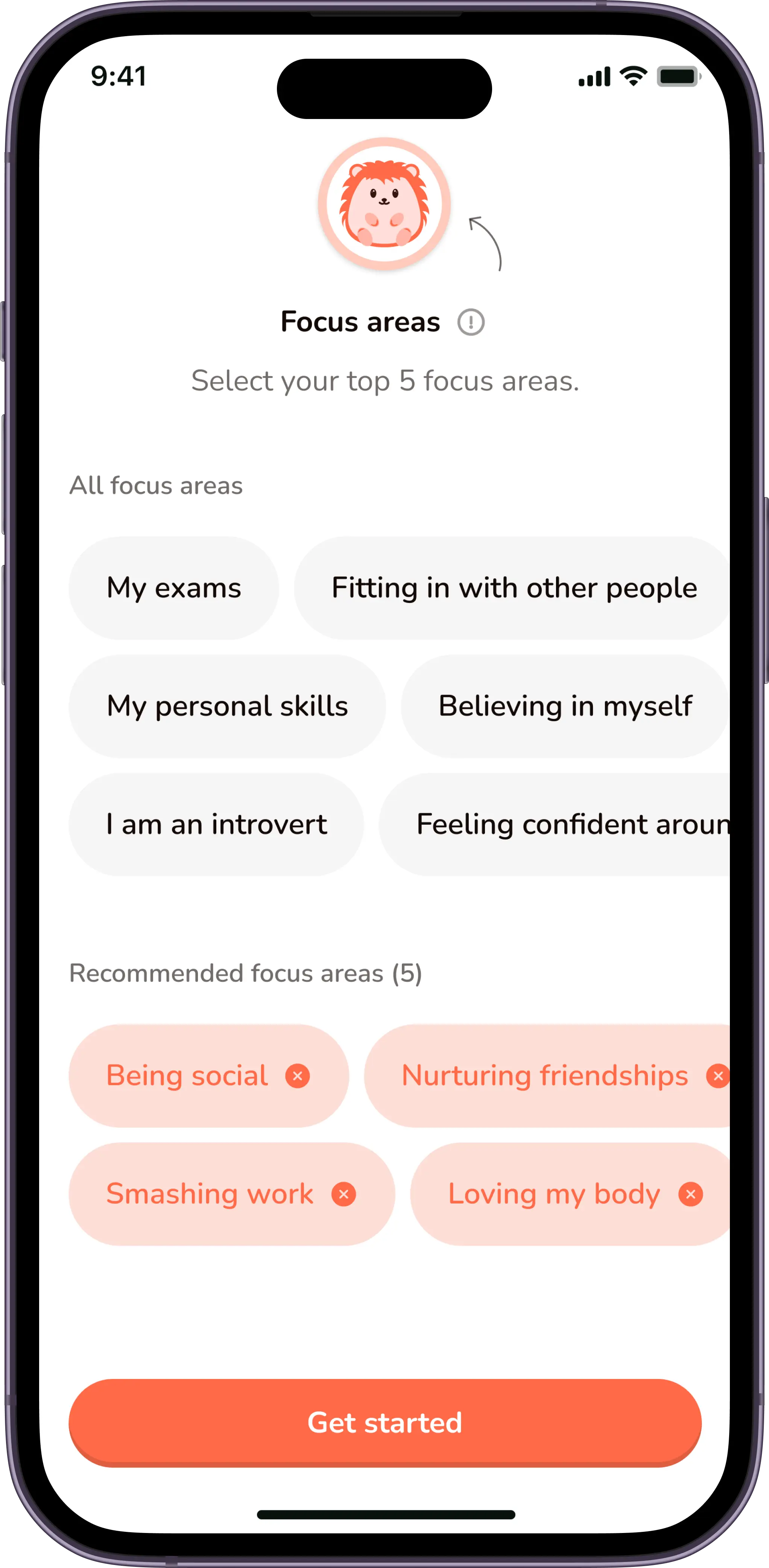
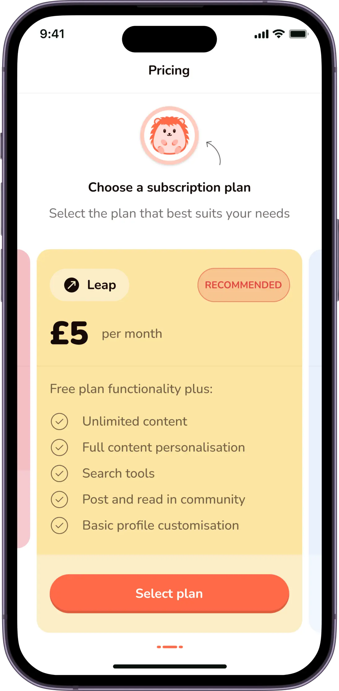
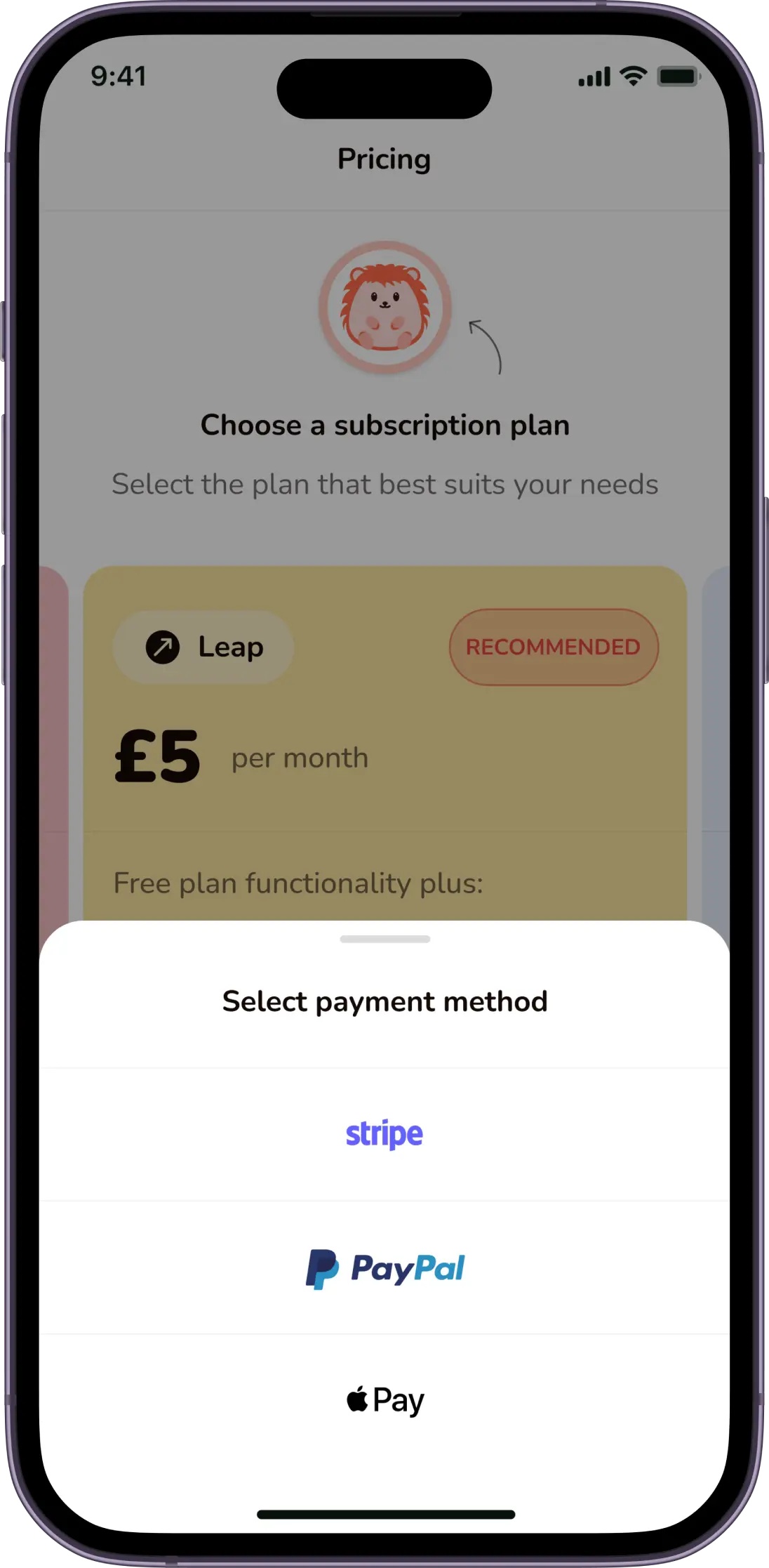
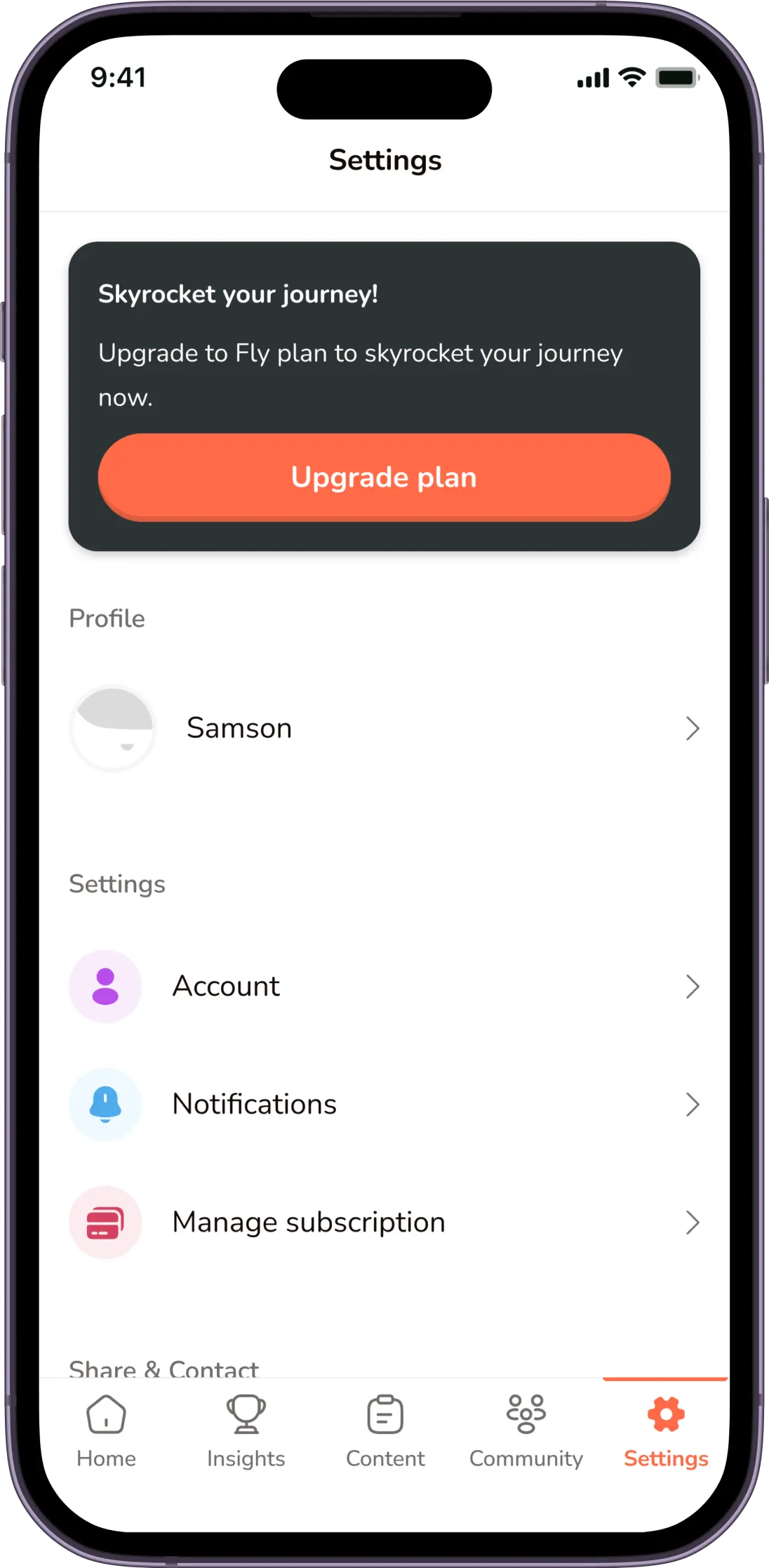
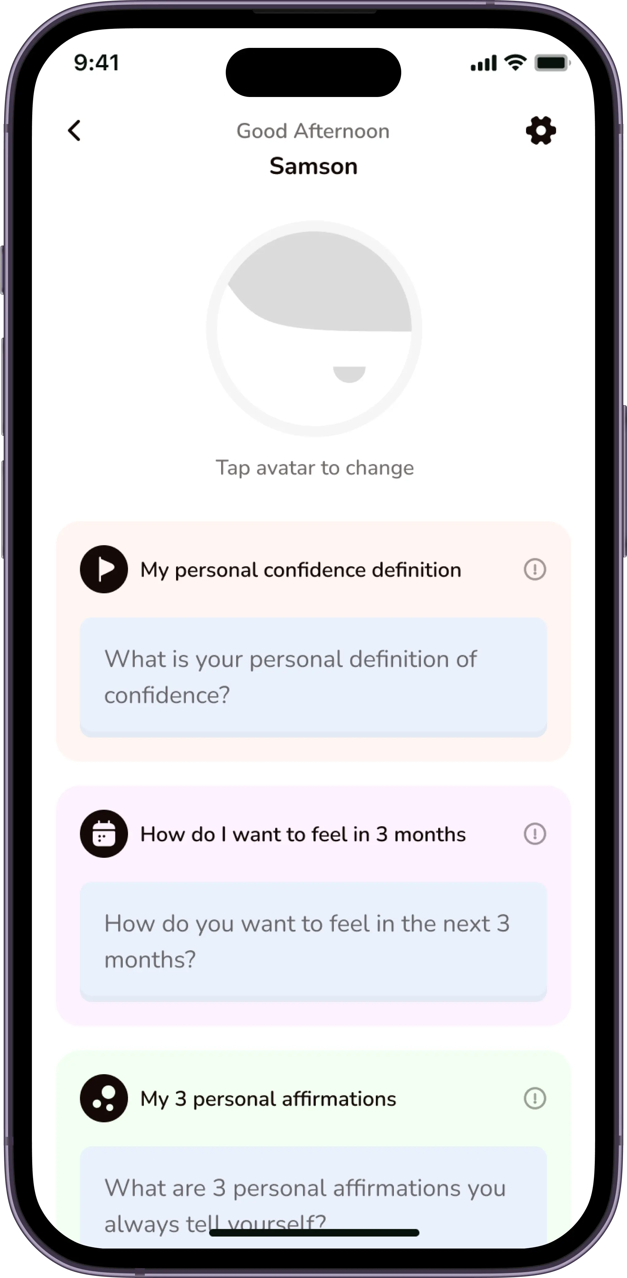
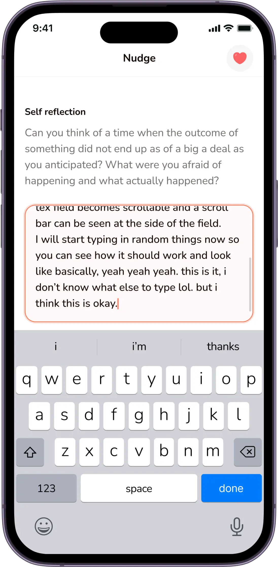
After reviewing the user flows & journeys, the existing screen designs and having conversations with stakeholders, it was time to finally get on the drawing board (Figma, lol).

Curtail call
Creating a beautiful and engaging interface and experience for users who struggle with mental health was an interesting task. The final result was happily received by both the stakeholders and the users of the platform.
I also learned how to lead a team of designers, as I was the lead designer in a team of four.
Next
Recurring payments
Case Study
Hopstair

This is a brief overview of this project (2 min read)
My role
User Interface Designer
User Experience Designer
Interaction Designer
What is HopStair?
Most people live lives that are rich with insecurities and poor coping mechanisms to account for things they are not at peace with. You might hide who you really are and pretend to be someone else, you might feel miserable inside – fearful, worried, anxious. You may just not like you or not believe in yourself.
HopStair helps identify these problems with the aid of carefully curated questionnaires which builds scientifically tested routines that help people do better and be better for themselves and the society.
The questionnaire


Objectives
Upon joining the team as the lead designer, research, user journeys, and wireframes had been designed by an external UX company. The previous designer had also worked on flows/screens from onboarding to the dashboard. My role focused on bringing these elements to life by developing high-fidelity prototypes, testing, and iterating based on user feedback. The goal was a consistent cross-platform design for both iOS and Android.
The quest
Even though research had been done and i had all i needed, i was still curious to understand some of the choices made. This led me to a deep dive into these decisions which would later lead my design choices. I gathered a small cohort of potential users and conducted interviews where i tested the already existing flows and designs. This investigation revealed some areas of improvement, and unfortunately the existing designs had to go, and the flows needed some minor tweaks.
The old design


Coming up with amazing ideas
This process involved brainstorming sessions with the other two(2) designers and the lead engineer on the team, to determine what was possible and what was not. I had to have an idea of the engineering teams tech stack and capabilities, this would help guide my decision making design-wise - that way we do not create designs that the engineering team cannot implement.
Key features
Content
Content includes nudges, quotes and facts all based around different confidence categories, these content are sent to users timely depending on their subscription plan.
Daily Mood Rating
Each user rates their mood and confidence on a daily basis, this rating is tracked within the app and users can check this data to know how they are improving.
Community
This is a section of the app where users post on different forums and have discussions anonymously in order to help one another feel better and be better.
In-app Confidence Coaches
If needed, users can signup for one-on-one confidence coaching mentorships all within the platform.
Now let me tell you about Hopsy
In a bid to foster engagement, the team came up with the idea of creating a custom Mascot called “Hopsy”, Hopsy would serve as an in-app buddy and help nudge/motivate users by creating a friendly bond with the users. We also came up with the idea of designing custom avatars, that users can use as their profile picture when interacting in the community, this would help keep each user anonymous and will make them feel more safe to share within the community.
The mascot & avatars
Hopsy

Avatars
Let's design!
After reviewing the user flows & journeys, the existing screen designs and having conversations with stakeholders, it was time to finally get on the drawing board (Figma, lol).


Curtail call
Creating a beautiful and engaging interface and experience for users who struggle with mental health was an interesting task. The final result was happily received by both the stakeholders and the users of the platform.
I also learned how to lead a team of designers, as I was the lead designer in a team of four.
Next
Recurring payments

Case Study
Hopstair

This is a brief overview of this project (2 min read)
My role
User Interface Designer
User Experience Designer
Interaction Designer
What is HopStair?
Most people live lives that are rich with insecurities and poor coping mechanisms to account for things they are not at peace with. You might hide who you really are and pretend to be someone else, you might feel miserable inside – fearful, worried, anxious. You may just not like you or not believe in yourself.
HopStair helps identify these problems with the aid of carefully curated questionnaires which builds scientifically tested routines that help people do better and be better for themselves and the society.
The questionnaire


Objectives
Upon joining the team as the lead designer, research, user journeys, and wireframes had been designed by an external UX company. The previous designer had also worked on flows/screens from onboarding to the dashboard. My role focused on bringing these elements to life by developing high-fidelity prototypes, testing, and iterating based on user feedback. The goal was a consistent cross-platform design for both iOS and Android.
The quest
Even though research had been done and i had all i needed, i was still curious to understand some of the choices made. This led me to a deep dive into these decisions which would later lead my design choices. I gathered a small cohort of potential users and conducted interviews where i tested the already existing flows and designs. This investigation revealed some areas of improvement, and unfortunately the existing designs had to go, and the flows needed some minor tweaks.
The old design


Coming up with amazing ideas
This process involved brainstorming sessions with the other two(2) designers and the lead engineer on the team, to determine what was possible and what was not. I had to have an idea of the engineering teams tech stack and capabilities, this would help guide my decision making design-wise - that way we do not create designs that the engineering team cannot implement.
Key features
Content
Content includes nudges, quotes and facts all based around different confidence categories, these content are sent to users timely depending on their subscription plan.
Daily Mood Rating
Each user rates their mood and confidence on a daily basis, this rating is tracked within the app and users can check this data to know how they are improving.
Community
This is a section of the app where users post on different forums and have discussions anonymously in order to help one another feel better and be better.
In-app Confidence Coaches
If needed, users can signup for one-on-one confidence coaching mentorships all within the platform.
Now let me tell you about Hopsy
In a bid to foster engagement, the team came up with the idea of creating a custom Mascot called “Hopsy”, Hopsy would serve as an in-app buddy and help nudge/motivate users by creating a friendly bond with the users. We also came up with the idea of designing custom avatars, that users can use as their profile picture when interacting in the community, this would help keep each user anonymous and will make them feel more safe to share within the community.
The mascot & avatars
Hopsy

Avatars
Let's design!
After reviewing the user flows & journeys, the existing screen designs and having conversations with stakeholders, it was time to finally get on the drawing board (Figma, lol).


Curtail call
Creating a beautiful and engaging interface and experience for users who struggle with mental health was an interesting task. The final result was happily received by both the stakeholders and the users of the platform.
I also learned how to lead a team of designers, as I was the lead designer in a team of four.
Next
Recurring payments

open for work