Case Study
Aggregator Dashboard
My role
User Interface Designer
User Experience Designer
Interaction Designer
First let me tell you about Paga
Paga is a leading mobile money company that is building an ecosystem to enable people to digitally send and receive money, and creating simple financial access for everyone.
Who are agents and aggregators?
Paga agents are individuals or businesses that help people carry out financial transactions like sending money, paying bills, and buying airtime. They work from shops or kiosks and make it easier for people—especially in areas without banks—to access Paga’s services.
Aggregators are basically super agents who have multiple sub-agents working under them.
Why are we doing this?
Paga's agent network comprises over 140,000 agent points across Nigeria, making it one of the largest financial services networks in the country.
These agents are pivotal in providing essential financial services such as cash deposits and withdrawals, bill payments, airtime top-ups, and money transfers, especially in underserved and rural communities.
Paga’s existing aggregator dashboard was quite basic and lacked the necessary functionality to effectively support aggregators. Unlike competitors, Paga’s aggregators couldn’t access comprehensive insights into their sub-agents’ performance or channel activity. This gap led to a surge in complaints—both online and during site visits—making it difficult for agents to operate at their full potential. It became clear that a change was needed. It was time to scale.
Taking a deep dive
To understand the challenges aggregators were facing, I collaborated closely with key stakeholders—customer support, product managers, engineers, and field agents. I reviewed support tickets, sat in on agent calls, and joined field visits to observe how aggregators used the dashboard in real-world settings. I also facilitated a few discovery sessions to gather pain points directly from agents and mapped their workflows to identify key gaps. Working with the data and engineering teams, I validated the feasibility of proposed features and used insights gathered to shape a more intuitive, insight-driven dashboard experience.
Key challenges faced by Aggregators
Most of our aggregators are not learned so we had to ensure the transition is smooth and the interface is simple
Lack of real-time information about sub-agent activity
Lack of actionable insights
Poor user experience and constant need to request support
What we aim to achieve
Our goals were simple but grounded in the needs of our agents and the vision for Paga’s future. I set out to transform not just the product, but how people experience financial freedom within and beyond Nigeria:
Improve the existing interface and functionalities ensuring scalability and usability
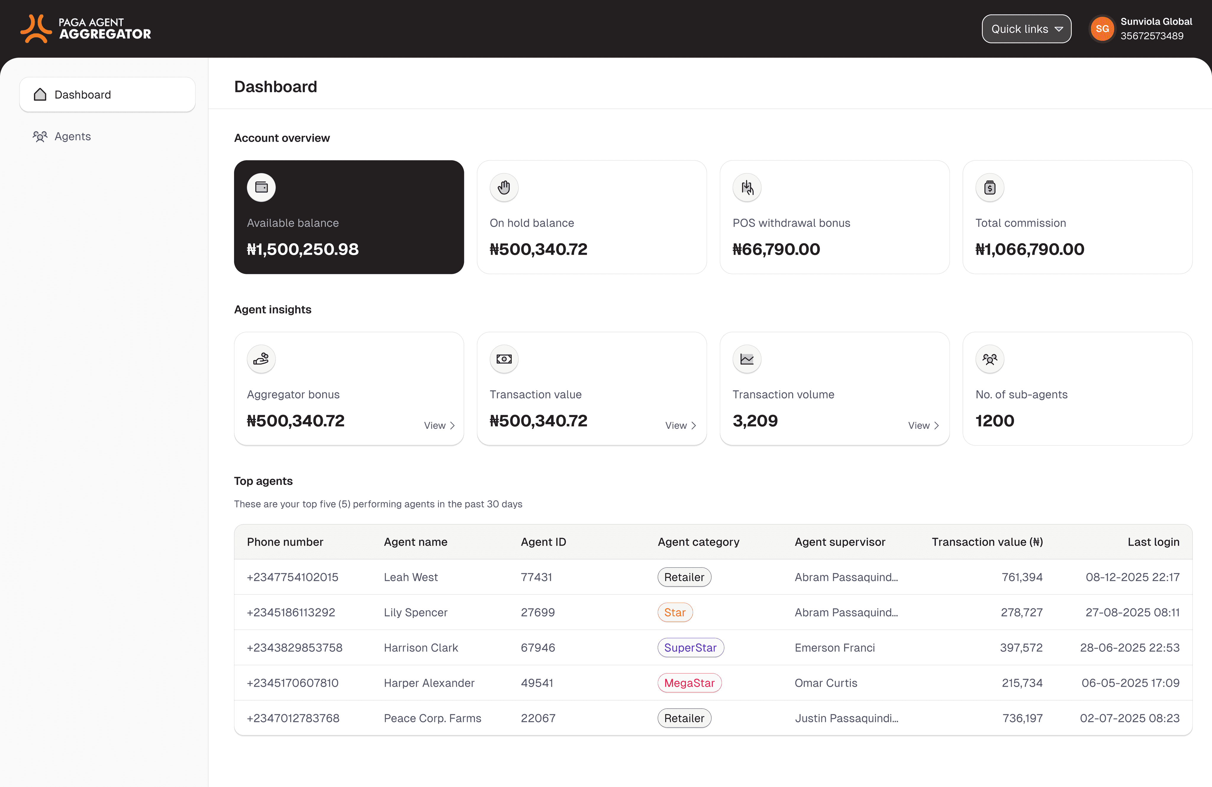
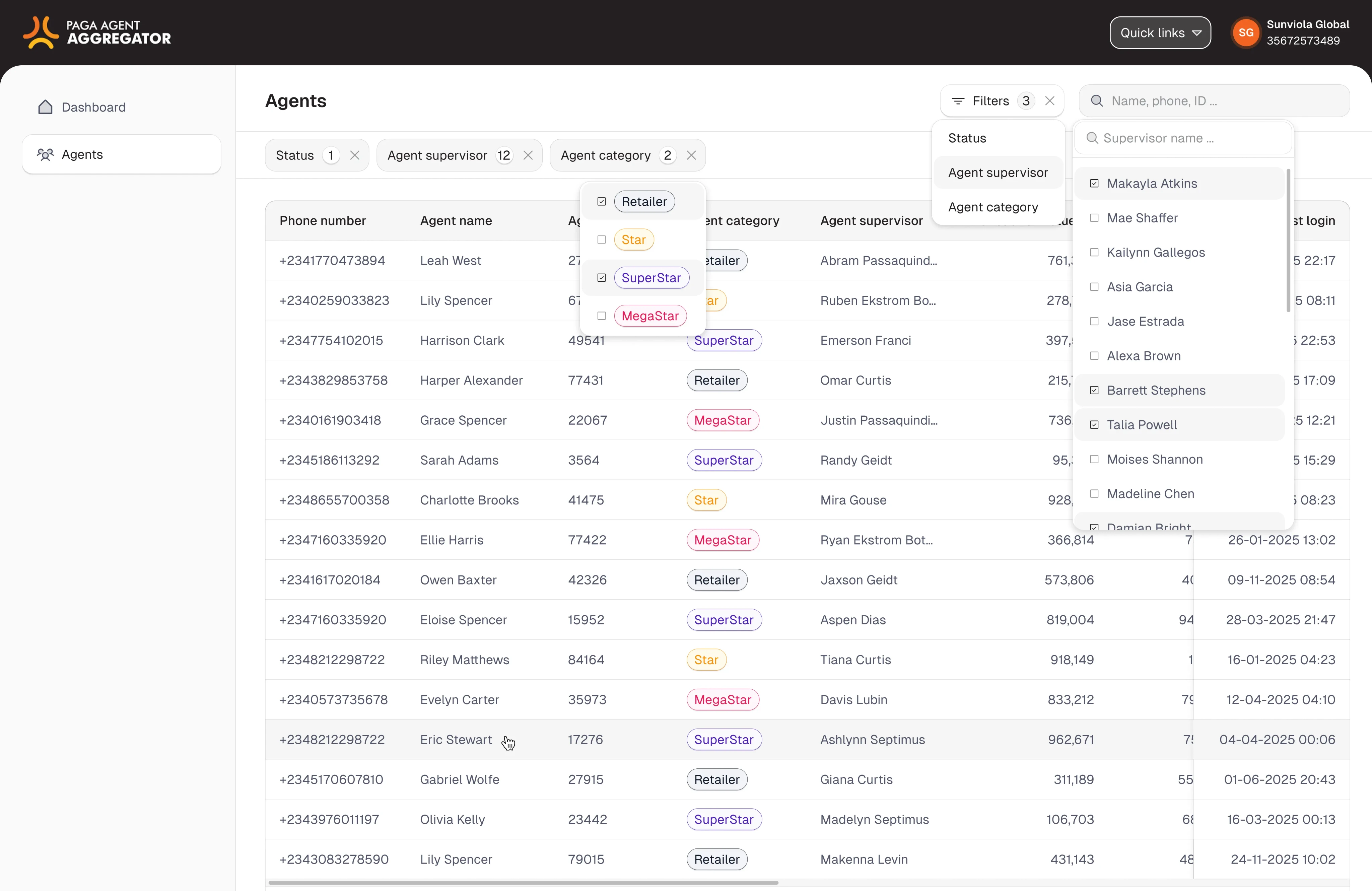
Give aggregators deeper insights into all sub-agents activities
Give agents control with self-service features like filters, and custom views without needing support.
Design and scalable and reliable tool that aggregators find easy to use
How we solved it
We launched a simplified MVP version of the aggregator dashboard focused on clarity, ease of use, and essential insights for our mostly non-technical agent base. The interface prioritizes key metrics, uses visual cues over complex text, and guides users with intuitive flows. We carried out multiple rounds of testing and feedback sessions with agents to ensure it met their real-world needs. While this release covers the most critical pain points, it lays a strong foundation for future scalability and feature expansion.
Let's design
Finally, for the best part—let’s dive into Figma and start designing!


The outcome and effect
The implementation of the new aggregator dashboard resulted in significant improvements in agents’ ability to monitor and manage their sub-agents effectively. It increased their access to real-time performance insights, reduced dependency on support, and boosted overall productivity as shows by the following metrics:
51% reduction in agent support requests
Improved sub-agent activity tracking
43% increase in agent satisfaction
39% increase in dashboard usage
Curtain call
This project really helped us tackle some major issues our aggregators were facing, especially around visibility and ease of use. Working closely with the agents, who aren’t very tech-savvy, gave me a clear picture of their real challenges. By focusing on a simple MVP with the most important features, we were able to deliver something that made a difference quickly. The feedback from agents was really valuable and showed we’re on the right track. There’s still room to grow and add more features, but this has set a solid foundation for scaling and making the dashboard even better.
Next
Recurring payments

open for work