Case Study
Optimised Onboarding
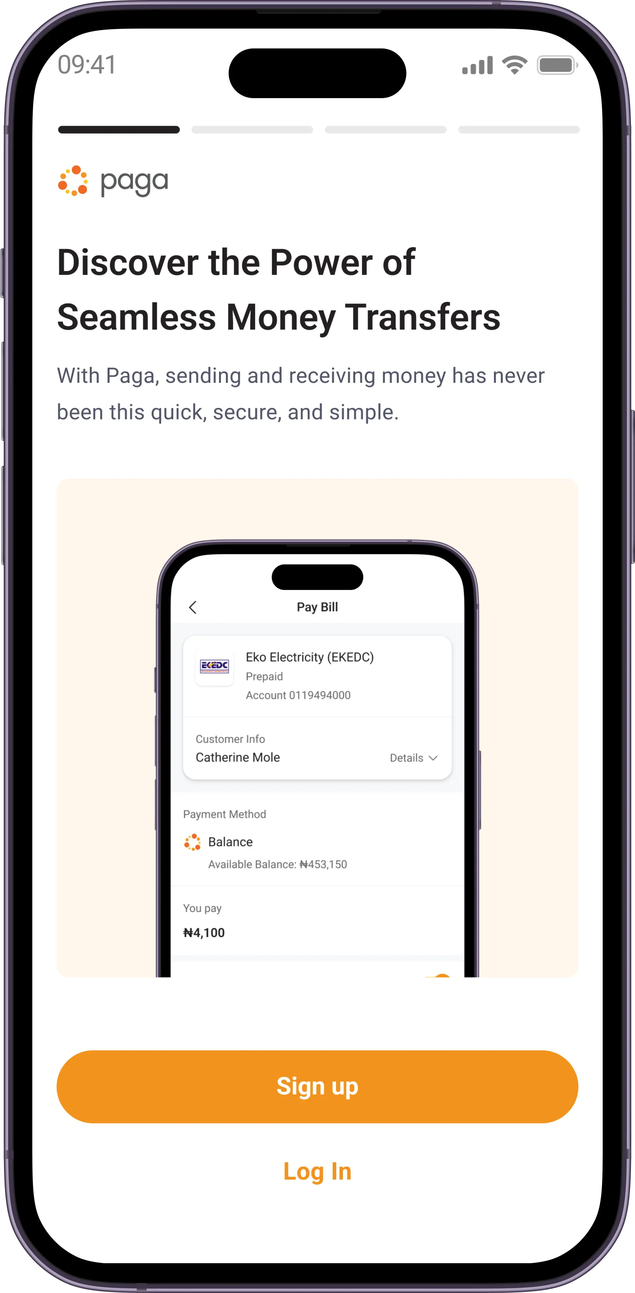
This is a brief overview of this project (3 min read)
My role
User Interface Designer
User Experience Designer
Interaction Designer
First let me tell you about Paga
Paga is a leading mobile money company that is building an ecosystem to enable people to digitally send and receive money, and creating simple financial access for everyone.
Why are we doing this?
Onboarding is a pivotal step in user activation, and the process can either break or make a product. After noticing multiple points of friction which in turn led to drop off during onboarding, we discovered some great opportunities to make onboarding on Paga more seamless and optimised. The previous onboarding flow was old and used some older technologies/integrations. We needed to minimise barriers on entry, and also foster higher user activation and retention, It was time for a change.
What we aim to achieve
Minimise user drop-off
Redesign the onboarding process to reduce drop-off rates at various stages, ensuring a higher percentage of users complete the process which in-turn leads to higher conversion rates.
Streamline onboarding
Create a more intuitive and streamlined onboarding experience that guides users through the necessary steps efficiently, reducing user confusion and frustration.
Optimise user experience
Implement design enhancements and latest integrations that align with best practices and regulatory compliances, reducing the amount of manual input during onboarding.
Taking a deep dive
In order to get a better understanding of what was going on, we (the product manager, growth team, and I) took a deeper look into the onboarding analytics to quantify drop-off rates at different stages of the process. After which we conducted user interviews and tests to have a better view of what users struggled with on the current onboarding flow.
This helped us to uncover most of the points of friction and gave us an idea of what needed to be done.
Key issues
Laborious onboarding process
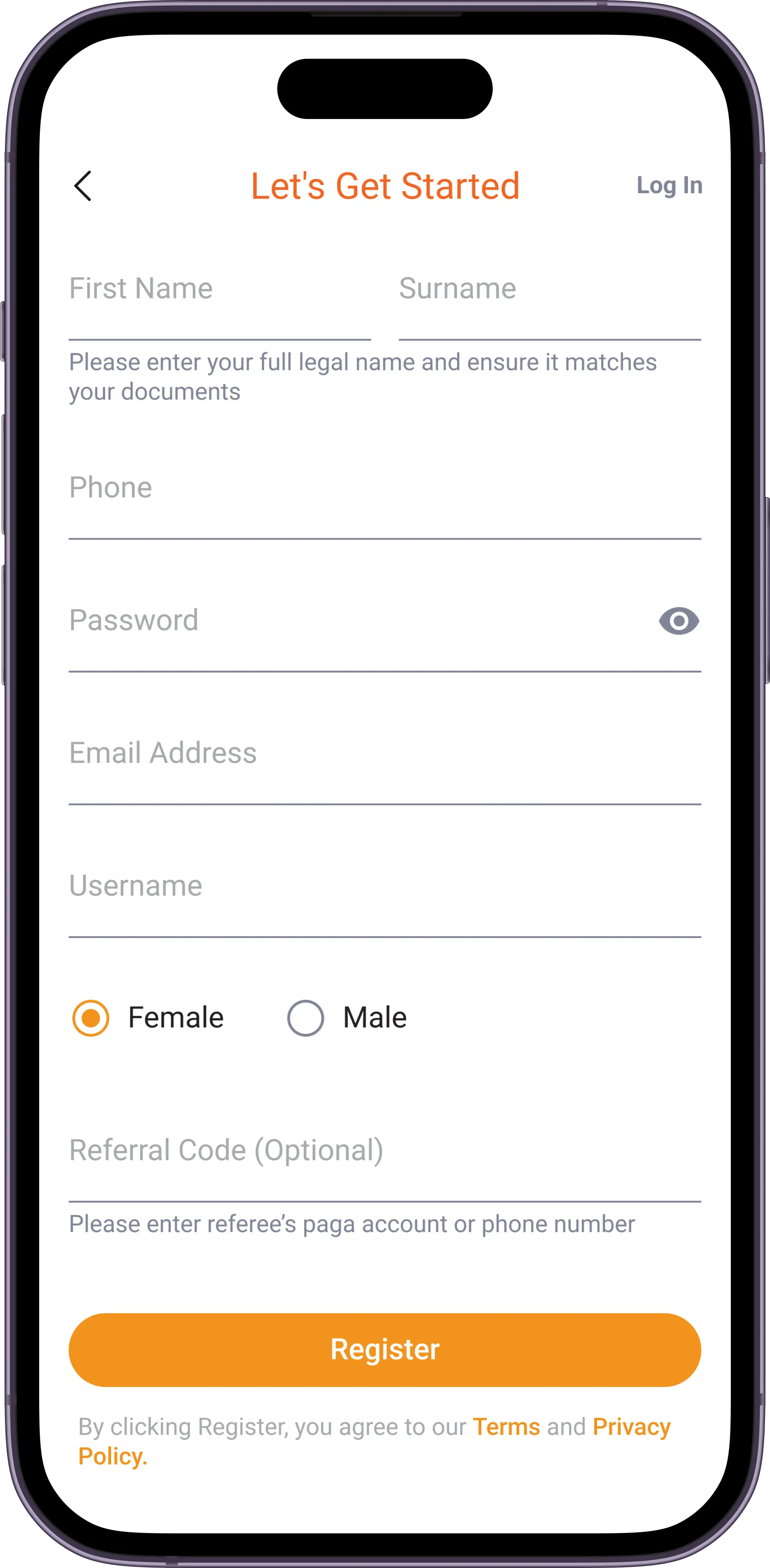
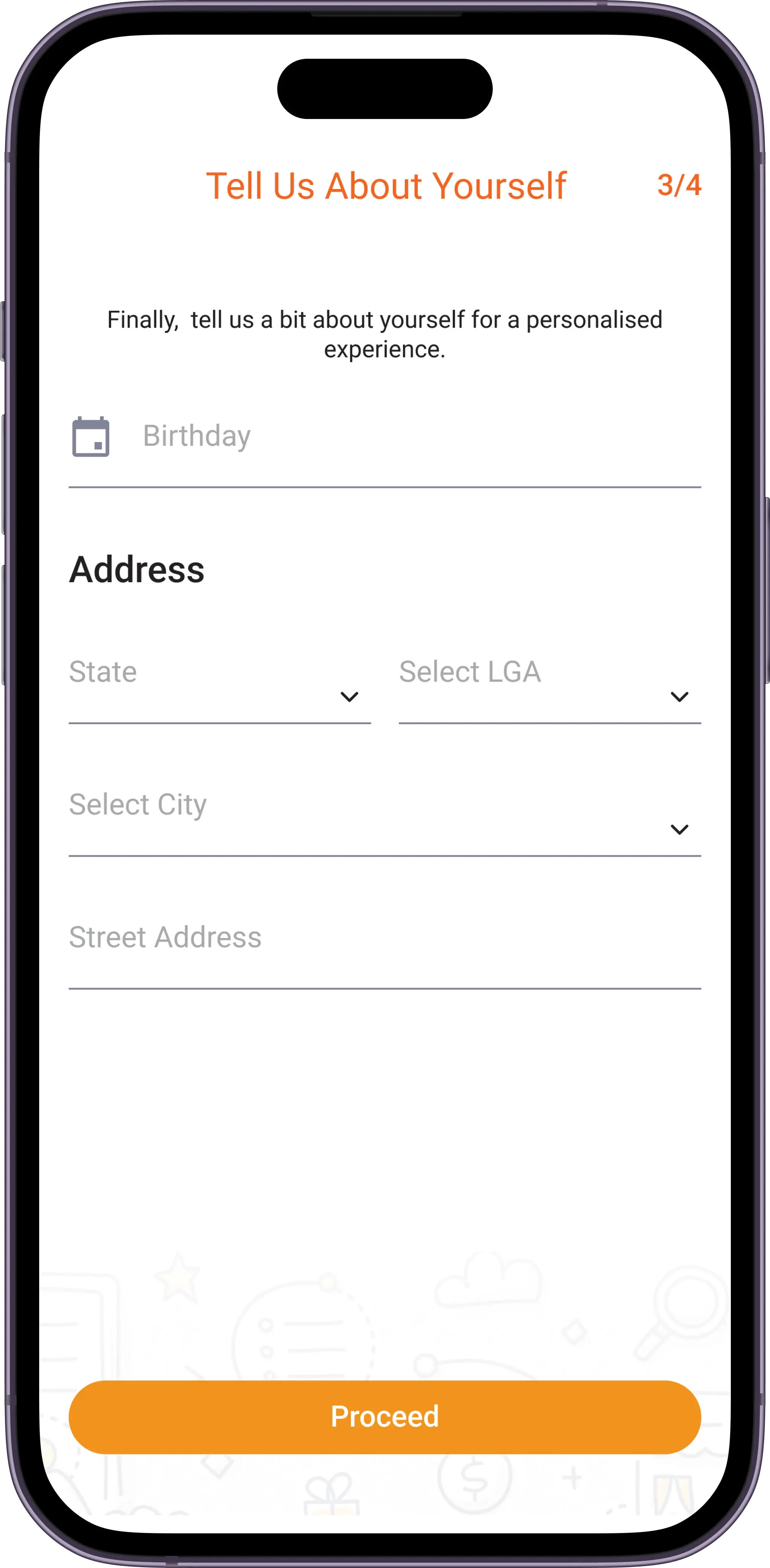
One major thing we took out from the user interviews was that the process required a lot of manual input (Name, Address, Gender, etc.). This lead to an increase in drop-off mid onboarding.
ID verification failure
Due to a number of reasons (unclear selfies and ID mix-match, etc.) a lot of IDs submitted by users during onboarding did not get validated once the users got on their dashboard, making it impossible for users to use Paga after a supposedly successful onboarding.
Manual selfie verification
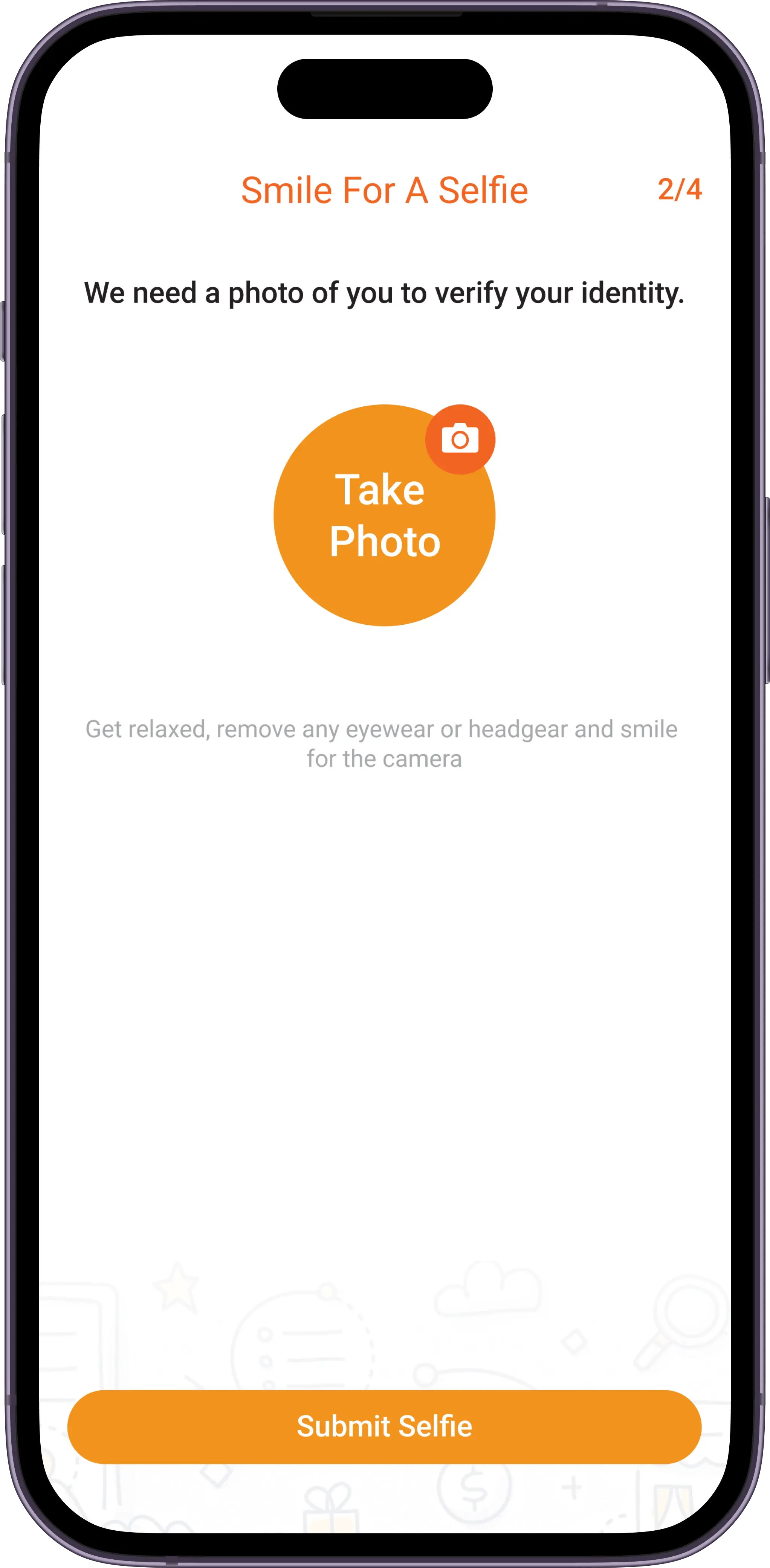
The current onboarding flow uses a manual selfie verification process failsafe, where agents validate user selfies with the ID provided on the backend. This process was very slow and and time consuming due to human error inefficiencies.
Inability to resume progress
In scenarios where users might accidentally close the app, or the app crashed, it was impossible for users to continue from where they left off making the already long process even longer.
How we solved it
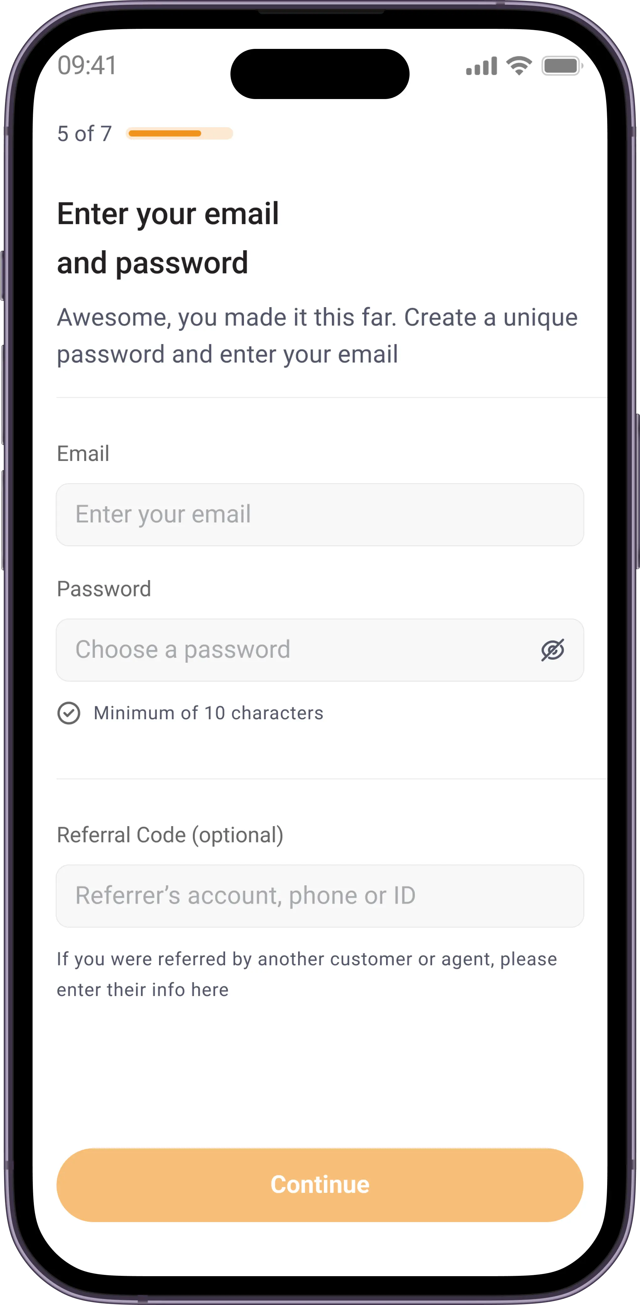
To tackle these issues and inadequacies, we took to analysing the onboarding of similar products and fintech apps to identify best practices, differentiators, and areas for improvement. We also integrated with a few databases that would help take away most of the manual efforts from users.
Here are some of the decisions made:
Integrating Smile SDK
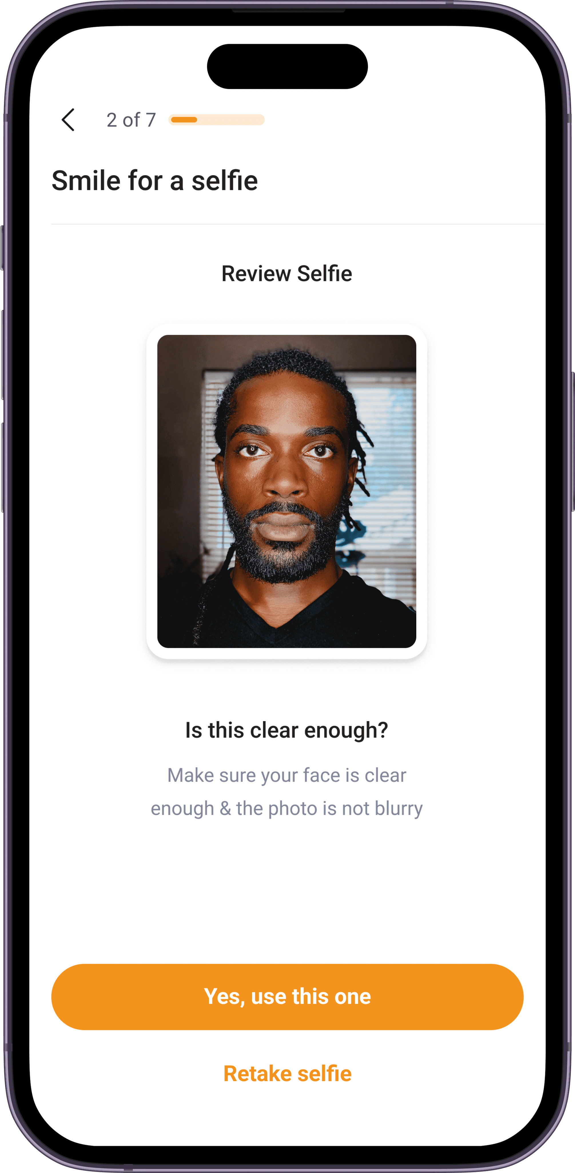
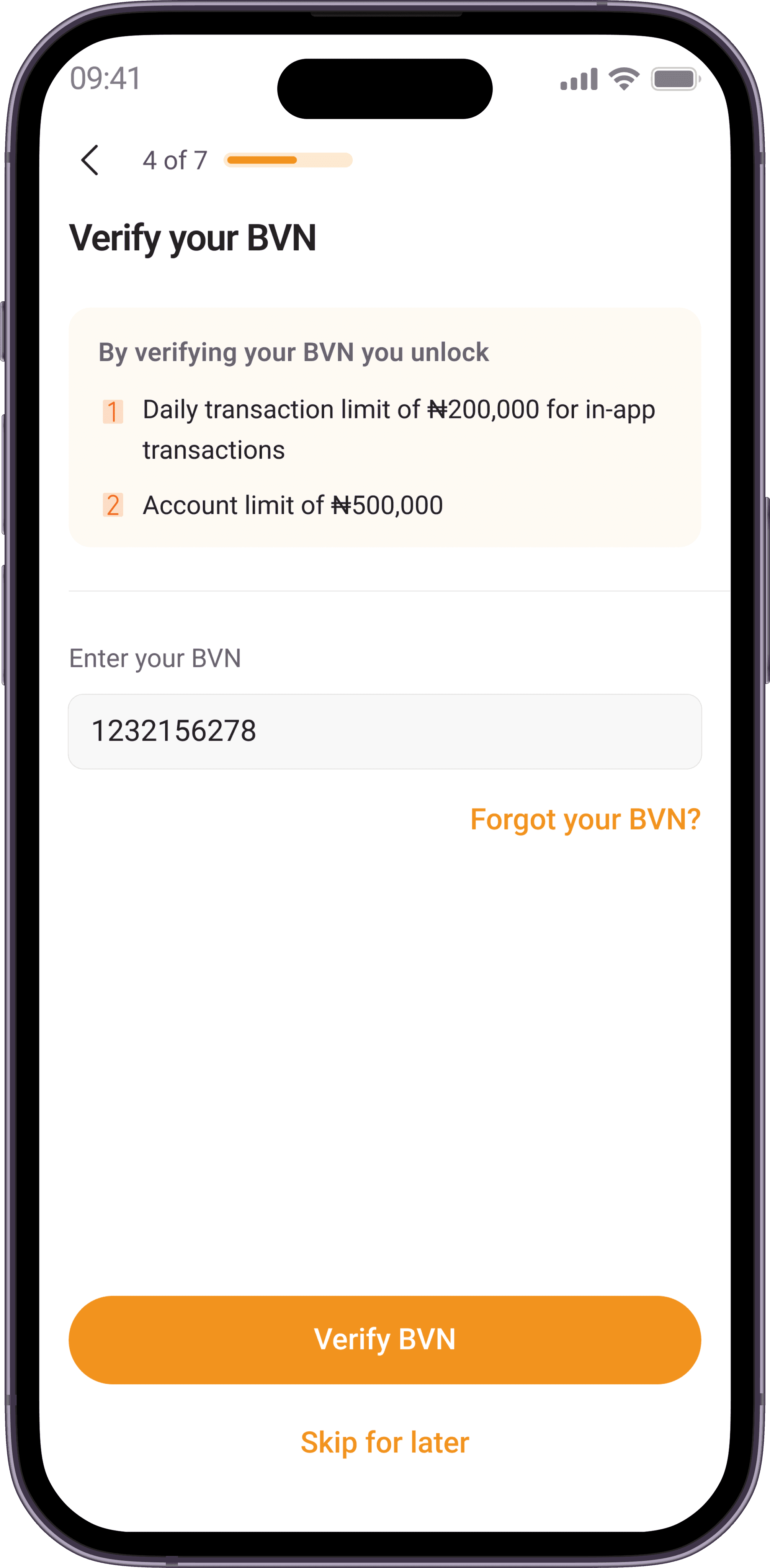
Smile SDK is a tool that automatically verifies user selfies and match it with the ID provided by users within seconds. Integrating this tool helped reduce selfie/ID mix-match and verification failure drastically, making the onboarding process quick and sweet.
Integrating Credequity
Credequity is a tool that provides identify verification, credit risk, financial capacity, digital onboarding, and KYC services.
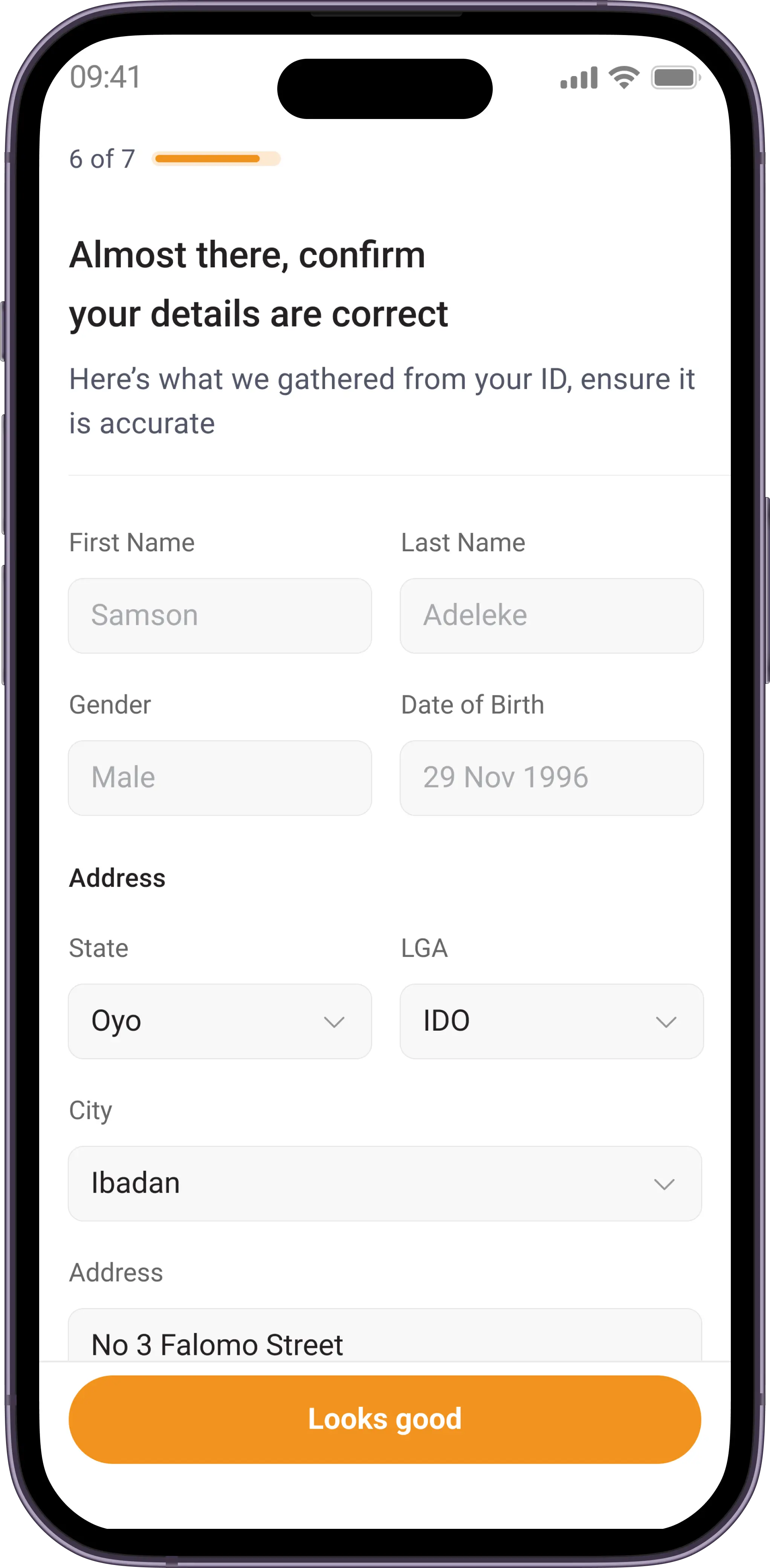
With this tool, upon user confirmation we were able to access their information (Name, DoB, Gender, etc.), therefore reducing the load of manual input.
Elimination of ID image upload
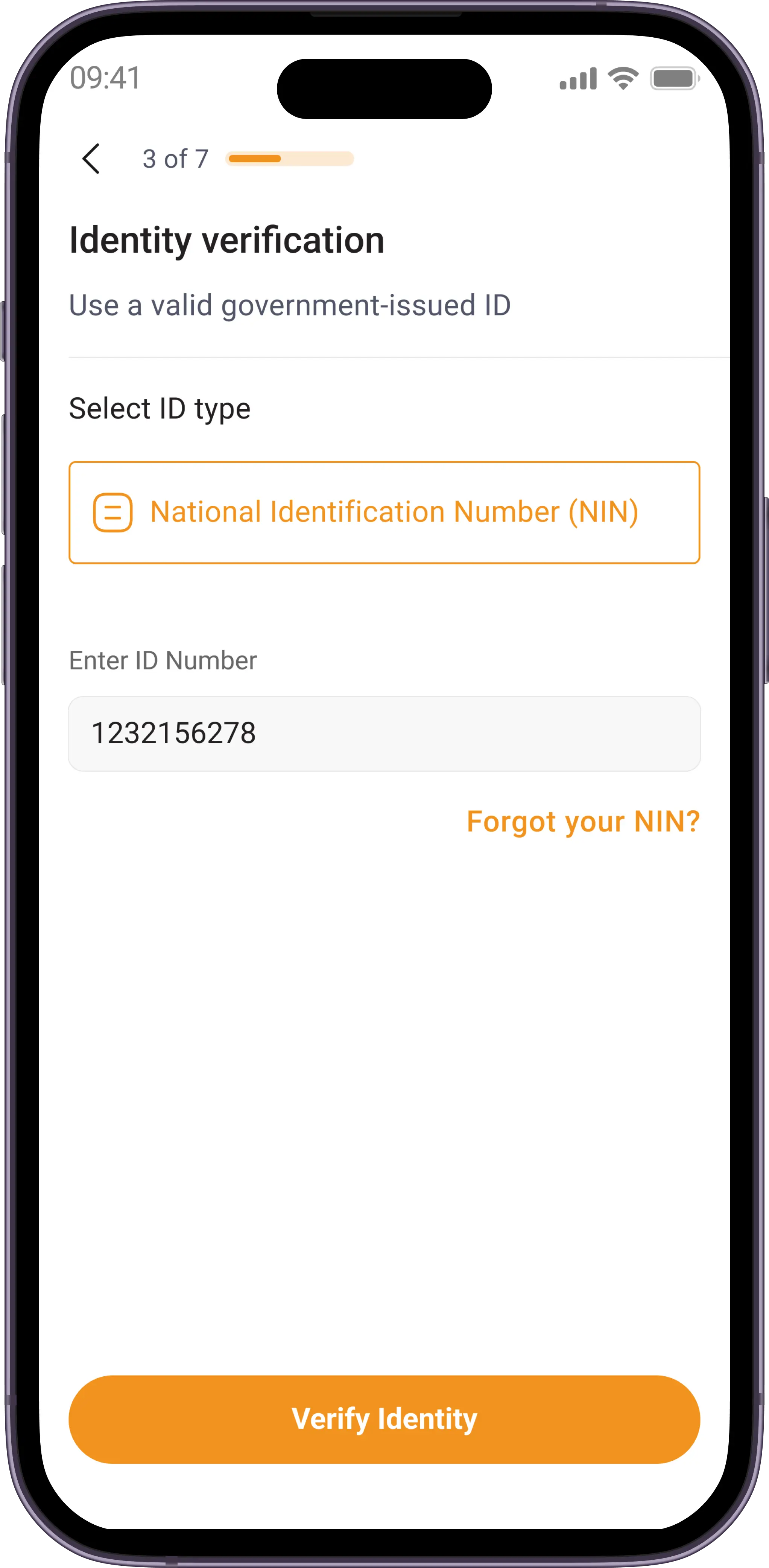
The implementation of CREDEQUiTY and Smile SDK would help us eradicate the need for users to upload photos of their ID manually, making the onboarding process a step shorter and eliminating any room for failure due to unclear ID photos. All users need to do is to input their ID number.
Implementation of checkpoints
I thought it would be a great idea to add checkpoints to the flow, these are sections in onboarding where users are able to pick up from in cases where they are unable to complete their onboarding at once, due to app crashes or accidental close of the app.
The old interface
User flows
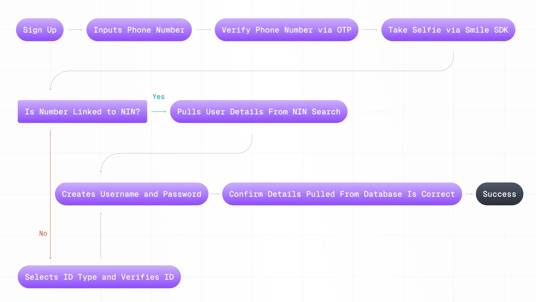
The onboarding can be completed in two primary flows, which are:
Flow 1 - Eliminating ID input
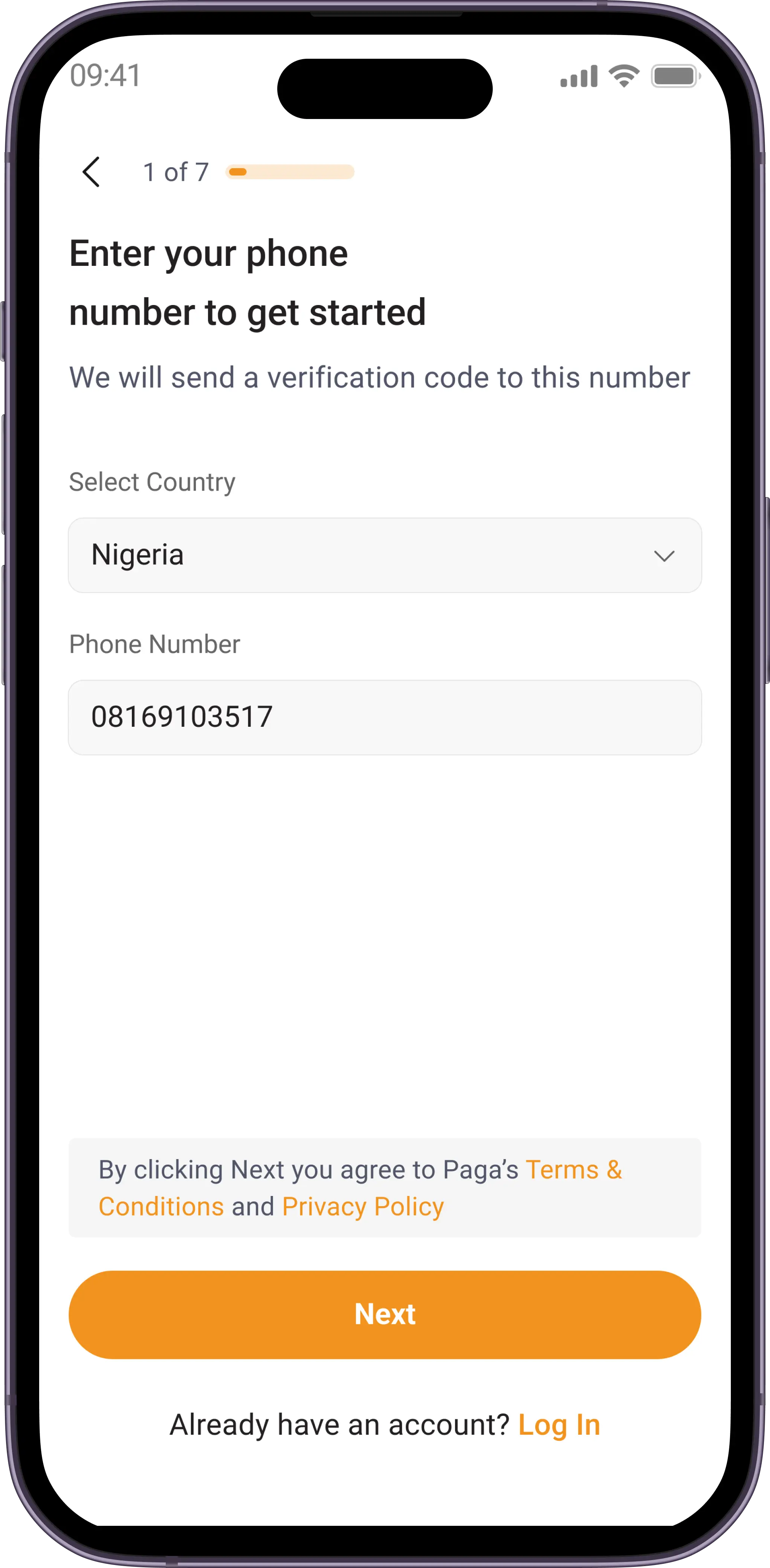
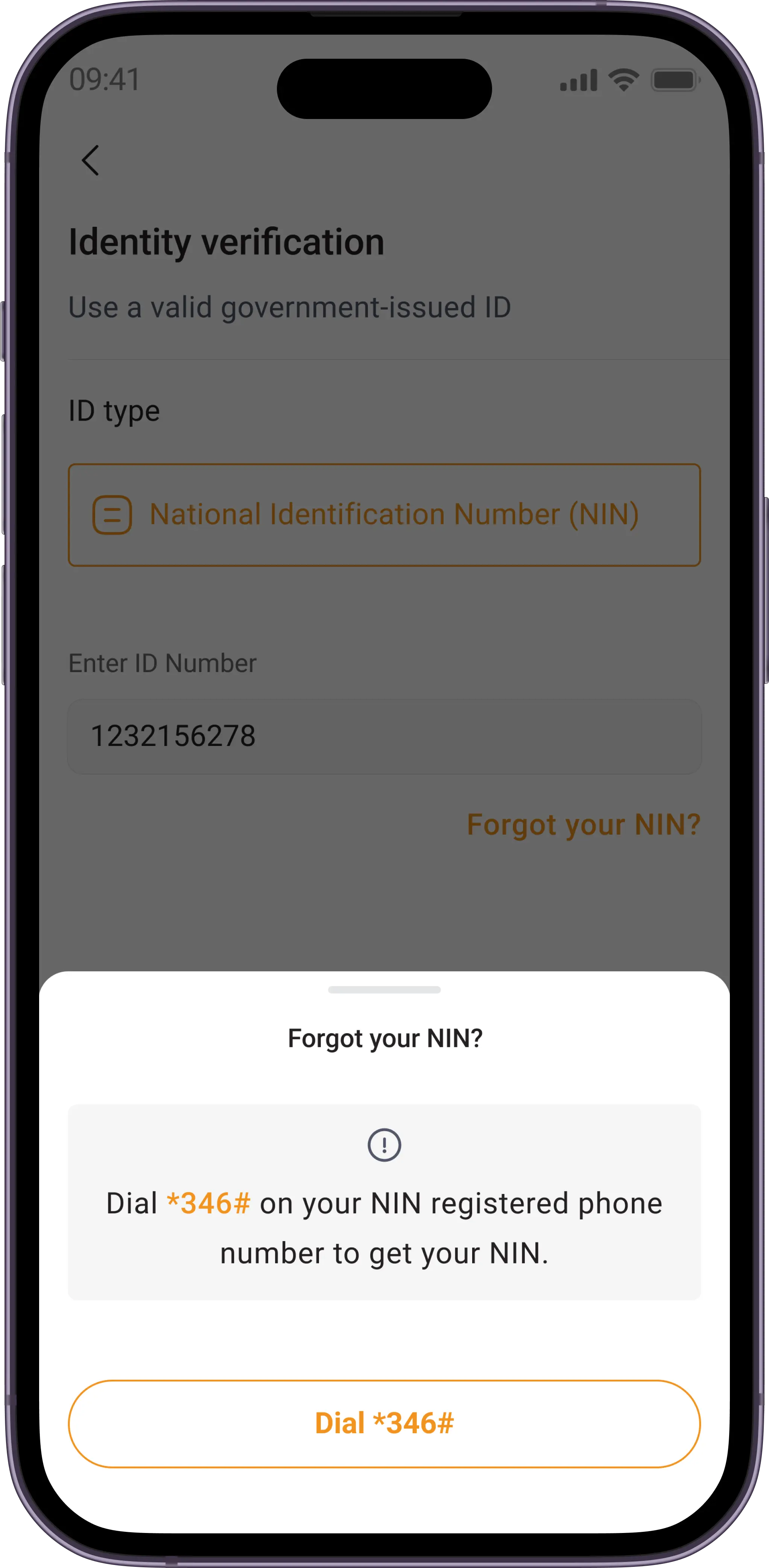
Users with their phone numbers linked to their National Identity Number(NIN) do not need to input ID numbers, because we use Credequity to run a check on the users phone number - if the number is linked to an NIN, we cross check their selfie with the image on the NIN to ensure we have a match. This makes the process a step shorter.
Flow 2 - A-Z
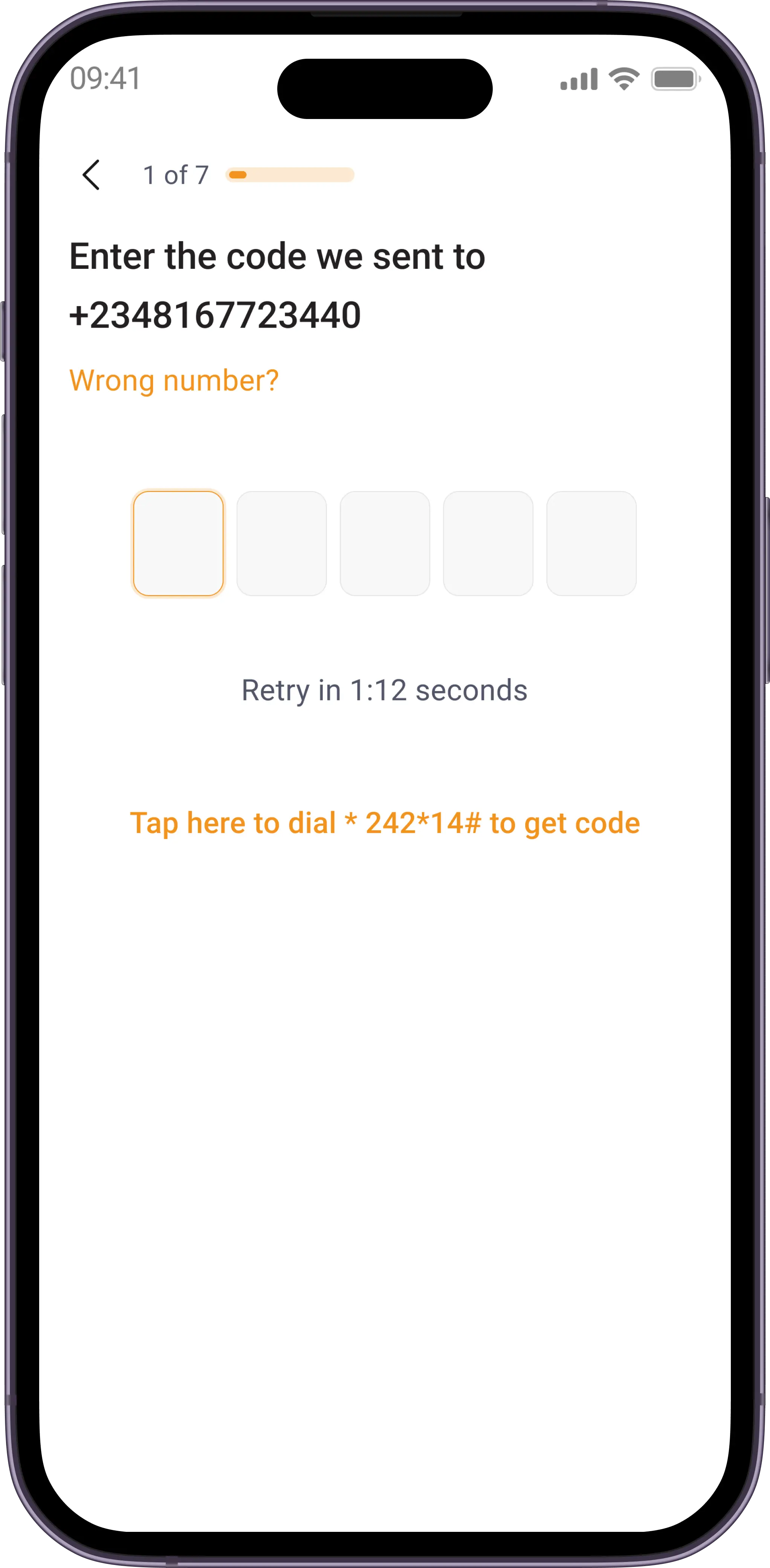
Users complete the registration process from A-Z, this includes verifying phone number, taking a selfie, inputting ID card number, and creating username/password.
Onboarding flow
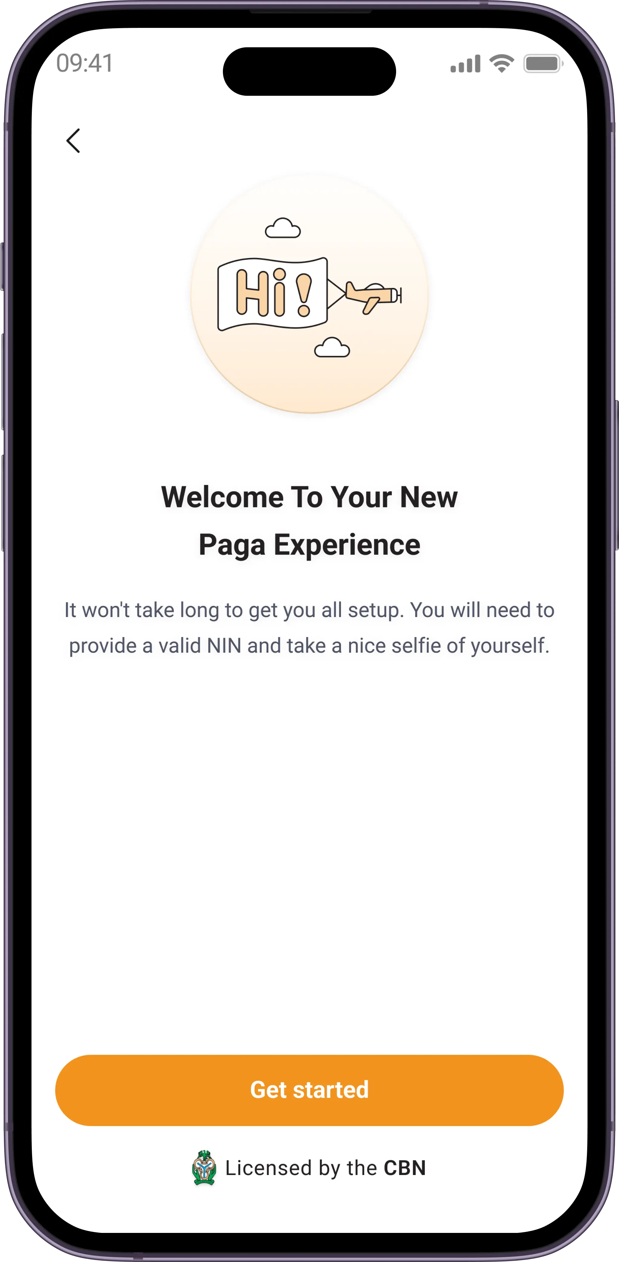
Let's design
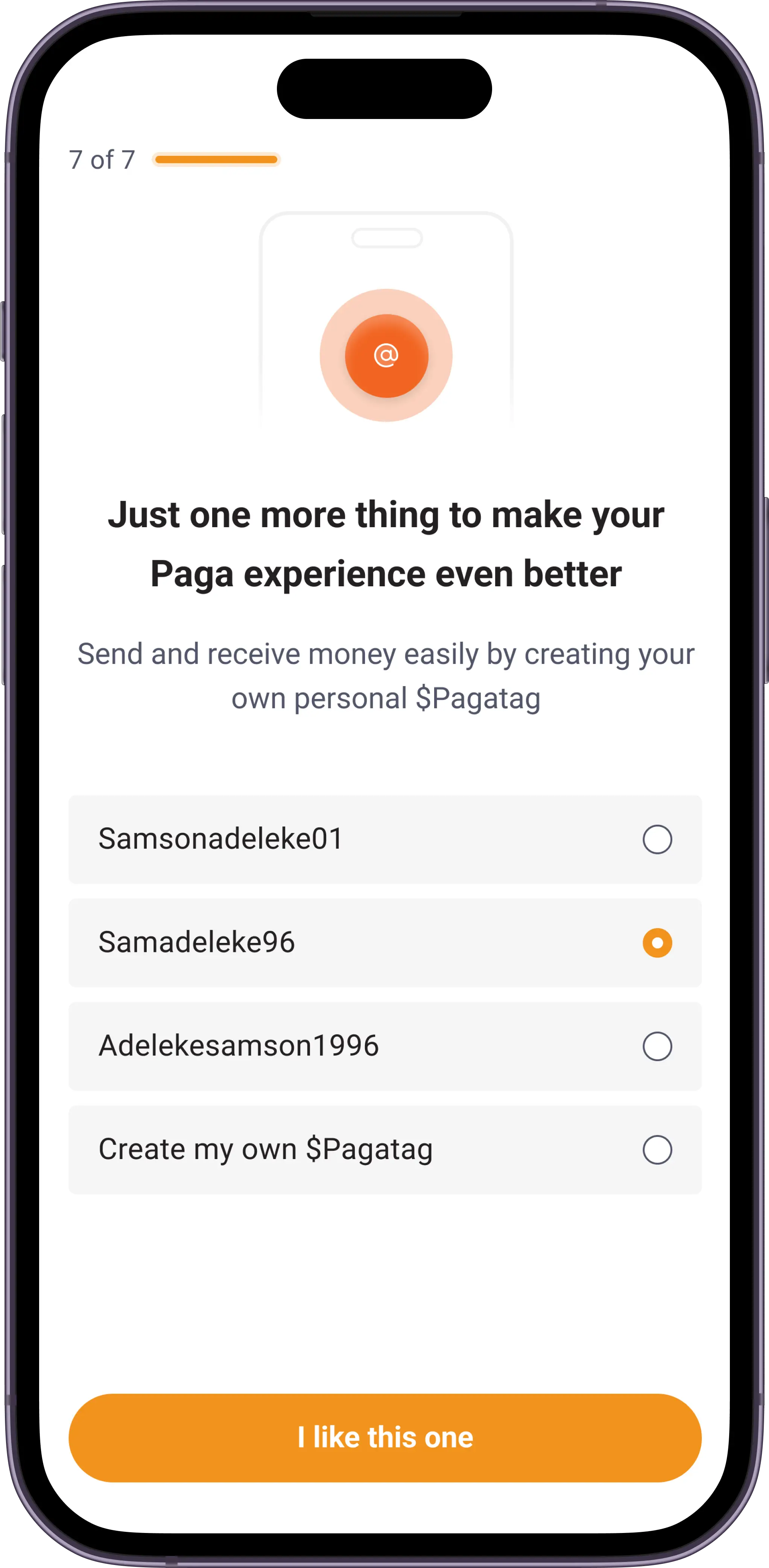
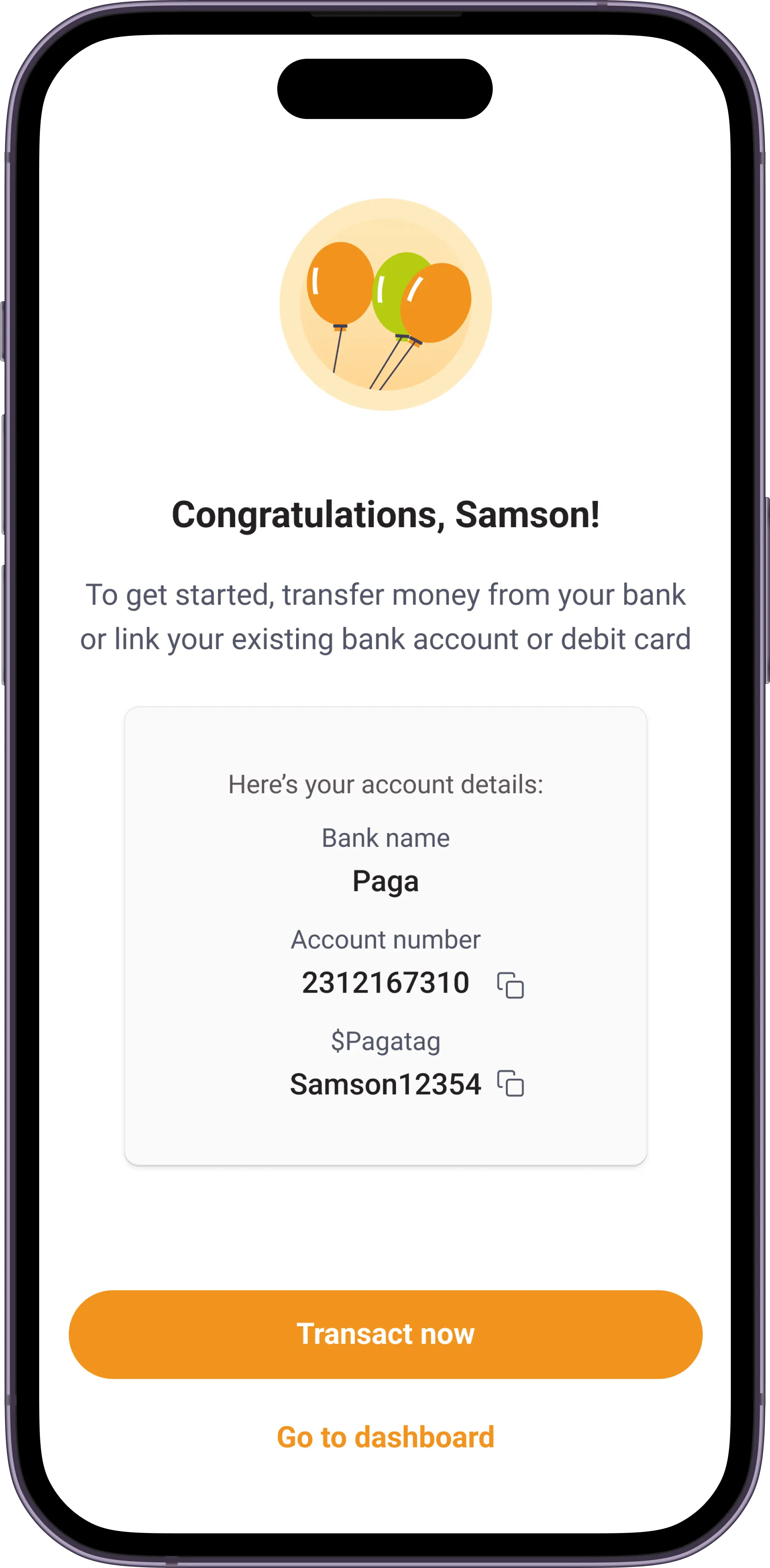
Finally, to the part where i turn this wonderful idea into visuals




The outcome and effect
The implementation of the new and optimised onboarding resulted in significant improvements in user activation and drop-off rates, as indicated by the following metrics:
Reduction in drop-off
The drop-off rate during onboarding witnessed a substantial decrease of 27% post-implementation. Users were more inclined to complete the onboarding process, indicating a smoother and more engaging experience
Increased completion rate
The completion rate for the onboarding flow saw a noteworthy increase of 20%. More users successfully navigated through the steps, translating to a higher number of active users.
Accelerated time to complete
The time required for users to complete the onboarding process decreased by 18%, this reflects the efficiency of the new flow
Curtail call
In retrospect, the redesign of the onboarding flow for the Paga was unequivocally successful in achieving the major objective of reducing drop-off rates. By designing a seamless and journey, we transformed the initial interaction between users and the product into a positive and efficient experience.
Next
Interactive receipts
Case Study
Optimised Onboarding

This is a brief overview of this project (3 min read)
My role
User Interface Designer
User Experience Designer
Interaction Designer
First let me tell you about Paga
Paga is a leading mobile money company that is building an ecosystem to enable people to digitally send and receive money, and creating simple financial access for everyone.
Why are we doing this?
Onboarding is a pivotal step in user activation, and the process can either break or make a product. After noticing multiple points of friction which in turn led to drop off during onboarding, we discovered some great opportunities to make onboarding on Paga more seamless and optimised. The previous onboarding flow was old and used some older technologies/integrations. We needed to minimise barriers on entry, and also foster higher user activation and retention, It was time for a change.
What we aim to achieve
Minimise user drop-off
Redesign the onboarding process to reduce drop-off rates at various stages, ensuring a higher percentage of users complete the process which in-turn leads to higher conversion rates.
Streamline onboarding
Create a more intuitive and streamlined onboarding experience that guides users through the necessary steps efficiently, reducing user confusion and frustration.
Optimise user experience
Implement design enhancements and latest integrations that align with best practices and regulatory compliances, reducing the amount of manual input during onboarding.


Taking a deep dive
In order to get a better understanding of what was going on, we (the product manager, growth team, and I) took a deeper look into the onboarding analytics to quantify drop-off rates at different stages of the process. After which we conducted user interviews and tests to have a better view of what users struggled with on the current onboarding flow.
This helped us to uncover most of the points of friction and gave us an idea of what needed to be done.
Key issues
Laborious onboarding process
One major thing we took out from the user interviews was that the process required a lot of manual input (Name, Address, Gender, etc.). This lead to an increase in drop-off mid onboarding.
ID verification failure
Due to a number of reasons (unclear selfies and ID mix-match, etc.) a lot of IDs submitted by users during onboarding did not get validated once the users got on their dashboard, making it impossible for users to use Paga after a supposedly successful onboarding.
Manual selfie verification
The current onboarding flow uses a manual selfie verification process failsafe, where agents validate user selfies with the ID provided on the backend. This process was very slow and and time consuming due to human error inefficiencies.
Inability to resume progress
In scenarios where users might accidentally close the app, or the app crashed, it was impossible for users to continue from where they left off making the already long process even longer.
How we solved it
To tackle these issues and inadequacies, we took to analysing the onboarding of similar products and fintech apps to identify best practices, differentiators, and areas for improvement. We also integrated with a few databases that would help take away most of the manual efforts from users.
Here are some of the decisions made:
Integrating Smile SDK
Smile SDK is a tool that automatically verifies user selfies and match it with the ID provided by users within seconds. Integrating this tool helped reduce selfie/ID mix-match and verification failure drastically, making the onboarding process quick and sweet.
Integrating Credequity
Credequity is a tool that provides identify verification, credit risk, financial capacity, digital onboarding, and KYC services.
With this tool, upon user confirmation we were able to access their information (Name, DoB, Gender, etc.), therefore reducing the load of manual input.
Elimination of ID image upload
The implementation of CREDEQUiTY and Smile SDK would help us eradicate the need for users to upload photos of their ID manually, making the onboarding process a step shorter and eliminating any room for failure due to unclear ID photos. All users need to do is to input their ID number.
Implementation of checkpoints
I thought it would be a great idea to add checkpoints to the flow, these are sections in onboarding where users are able to pick up from in cases where they are unable to complete their onboarding at once, due to app crashes or accidental close of the app.
The old interface


User flows
The onboarding can be completed in two primary flows, which are:
Flow 1 - Eliminating ID input
Users with their phone numbers linked to their National Identity Number(NIN) do not need to input ID numbers, because we use Credequity to run a check on the users phone number - if the number is linked to an NIN, we cross check their selfie with the image on the NIN to ensure we have a match. This makes the process a step shorter.
Flow 2 - A-Z
Users complete the registration process from A-Z, this includes verifying phone number, taking a selfie, inputting ID card number, and creating username/password.
Onboarding flow

Let's design
Finally, to the part where i turn this wonderful idea into visuals


The outcome and effect
The implementation of the new and optimised onboarding resulted in significant improvements in user activation and drop-off rates, as indicated by the following metrics:
Reduction in drop-off
The drop-off rate during onboarding witnessed a substantial decrease of 27% post-implementation. Users were more inclined to complete the onboarding process, indicating a smoother and more engaging experience
Increased completion rate
The completion rate for the onboarding flow saw a noteworthy increase of 20%. More users successfully navigated through the steps, translating to a higher number of active users.
Accelerated time to complete
The time required for users to complete the onboarding process decreased by 18%, this reflects the efficiency of the new flow
Curtail call
In retrospect, the redesign of the onboarding flow for the Paga was unequivocally successful in achieving the major objective of reducing drop-off rates. By designing a seamless and journey, we transformed the initial interaction between users and the product into a positive and efficient experience.
Next
Interactive receipts

Case Study
Optimised Onboarding

This is a brief overview of this project (3 min read)
My role
User Interface Designer
User Experience Designer
Interaction Designer
First let me tell you about Paga
Paga is a leading mobile money company that is building an ecosystem to enable people to digitally send and receive money, and creating simple financial access for everyone.
Why are we doing this?
Onboarding is a pivotal step in user activation, and the process can either break or make a product. After noticing multiple points of friction which in turn led to drop off during onboarding, we discovered some great opportunities to make onboarding on Paga more seamless and optimised. The previous onboarding flow was old and used some older technologies/integrations. We needed to minimise barriers on entry, and also foster higher user activation and retention, It was time for a change.
What we aim to achieve
Minimise user drop-off
Redesign the onboarding process to reduce drop-off rates at various stages, ensuring a higher percentage of users complete the process which in-turn leads to higher conversion rates.
Streamline onboarding
Create a more intuitive and streamlined onboarding experience that guides users through the necessary steps efficiently, reducing user confusion and frustration.
Optimise user experience
Implement design enhancements and latest integrations that align with best practices and regulatory compliances, reducing the amount of manual input during onboarding.


Taking a deep dive
In order to get a better understanding of what was going on, we (the product manager, growth team, and I) took a deeper look into the onboarding analytics to quantify drop-off rates at different stages of the process. After which we conducted user interviews and tests to have a better view of what users struggled with on the current onboarding flow.
This helped us to uncover most of the points of friction and gave us an idea of what needed to be done.
Key issues
Laborious onboarding process
One major thing we took out from the user interviews was that the process required a lot of manual input (Name, Address, Gender, etc.). This lead to an increase in drop-off mid onboarding.
ID verification failure
Due to a number of reasons (unclear selfies and ID mix-match, etc.) a lot of IDs submitted by users during onboarding did not get validated once the users got on their dashboard, making it impossible for users to use Paga after a supposedly successful onboarding.
Manual selfie verification
The current onboarding flow uses a manual selfie verification process failsafe, where agents validate user selfies with the ID provided on the backend. This process was very slow and and time consuming due to human error inefficiencies.
Inability to resume progress
In scenarios where users might accidentally close the app, or the app crashed, it was impossible for users to continue from where they left off making the already long process even longer.
How we solved it
To tackle these issues and inadequacies, we took to analysing the onboarding of similar products and fintech apps to identify best practices, differentiators, and areas for improvement. We also integrated with a few databases that would help take away most of the manual efforts from users.
Here are some of the decisions made:
Integrating Smile SDK
Smile SDK is a tool that automatically verifies user selfies and match it with the ID provided by users within seconds. Integrating this tool helped reduce selfie/ID mix-match and verification failure drastically, making the onboarding process quick and sweet.
Integrating Credequity
Credequity is a tool that provides identify verification, credit risk, financial capacity, digital onboarding, and KYC services.
With this tool, upon user confirmation we were able to access their information (Name, DoB, Gender, etc.), therefore reducing the load of manual input.
Elimination of ID image upload
The implementation of CREDEQUiTY and Smile SDK would help us eradicate the need for users to upload photos of their ID manually, making the onboarding process a step shorter and eliminating any room for failure due to unclear ID photos. All users need to do is to input their ID number.
Implementation of checkpoints
I thought it would be a great idea to add checkpoints to the flow, these are sections in onboarding where users are able to pick up from in cases where they are unable to complete their onboarding at once, due to app crashes or accidental close of the app.
The old interface


User flows
The onboarding can be completed in two primary flows, which are:
Flow 1 - Eliminating ID input
Users with their phone numbers linked to their National Identity Number(NIN) do not need to input ID numbers, because we use Credequity to run a check on the users phone number - if the number is linked to an NIN, we cross check their selfie with the image on the NIN to ensure we have a match. This makes the process a step shorter.
Flow 2 - A-Z
Users complete the registration process from A-Z, this includes verifying phone number, taking a selfie, inputting ID card number, and creating username/password.
Onboarding flow

Let's design
Finally, to the part where i turn this wonderful idea into visuals


The outcome and effect
The implementation of the new and optimised onboarding resulted in significant improvements in user activation and drop-off rates, as indicated by the following metrics:
Reduction in drop-off
The drop-off rate during onboarding witnessed a substantial decrease of 27% post-implementation. Users were more inclined to complete the onboarding process, indicating a smoother and more engaging experience
Increased completion rate
The completion rate for the onboarding flow saw a noteworthy increase of 20%. More users successfully navigated through the steps, translating to a higher number of active users.
Accelerated time to complete
The time required for users to complete the onboarding process decreased by 18%, this reflects the efficiency of the new flow
Curtail call
In retrospect, the redesign of the onboarding flow for the Paga was unequivocally successful in achieving the major objective of reducing drop-off rates. By designing a seamless and journey, we transformed the initial interaction between users and the product into a positive and efficient experience.
Next
Interactive receipts

open for work